Cbus
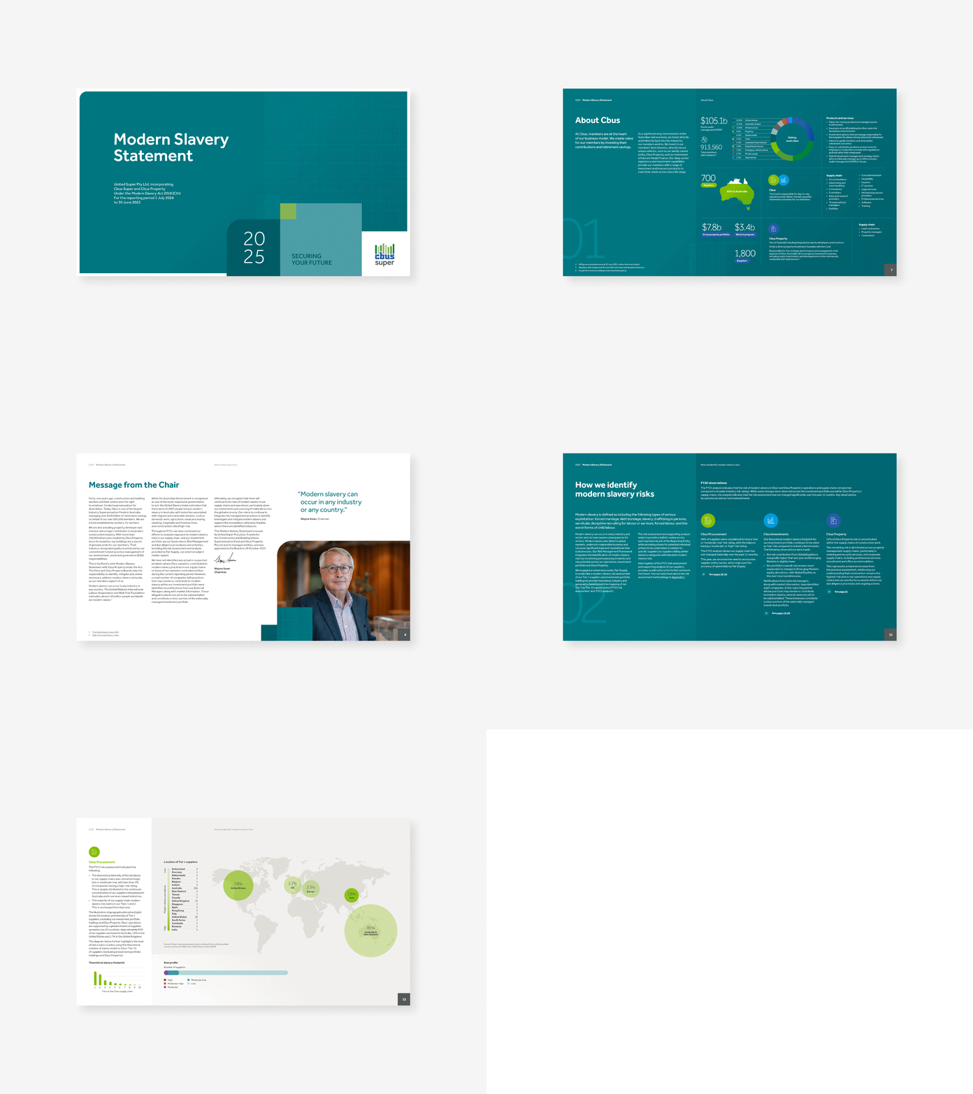
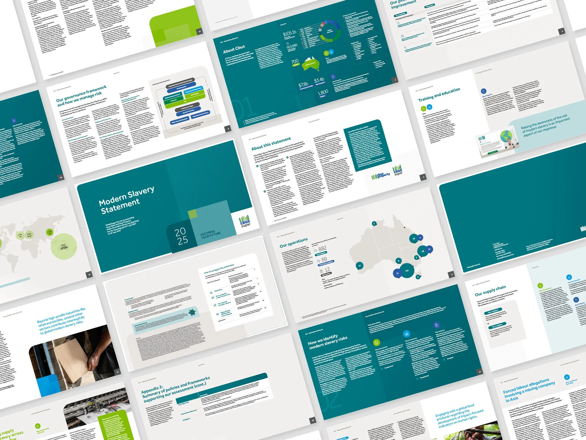
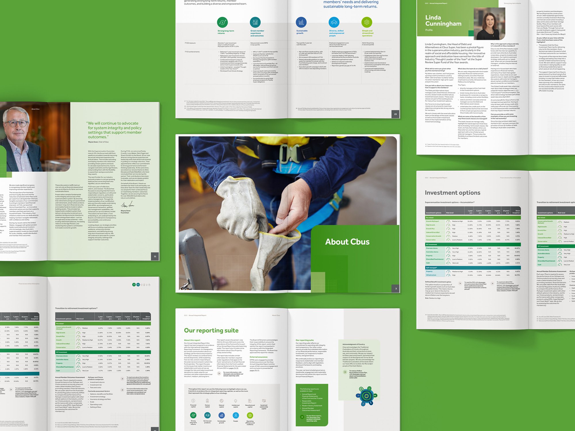
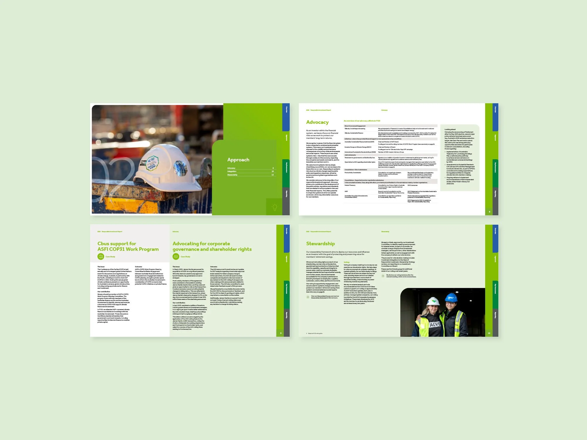
Cbus needed to deliver a complex, multi-document reporting suite amid heightened scrutiny, overlapping approvals and immovable deadlines. We partnered with the team to create a cohesive system spanning eight documents, elevating the design while simplifying delivery.
Cbus is a leading industry super fund with a large and diverse membership spanning construction, media, arts and professional services. In a sector facing increasing regulatory and public scrutiny, its reporting plays a critical role in building trust by clearly communicating performance, governance and long-term value to members, regulators and stakeholders alike.

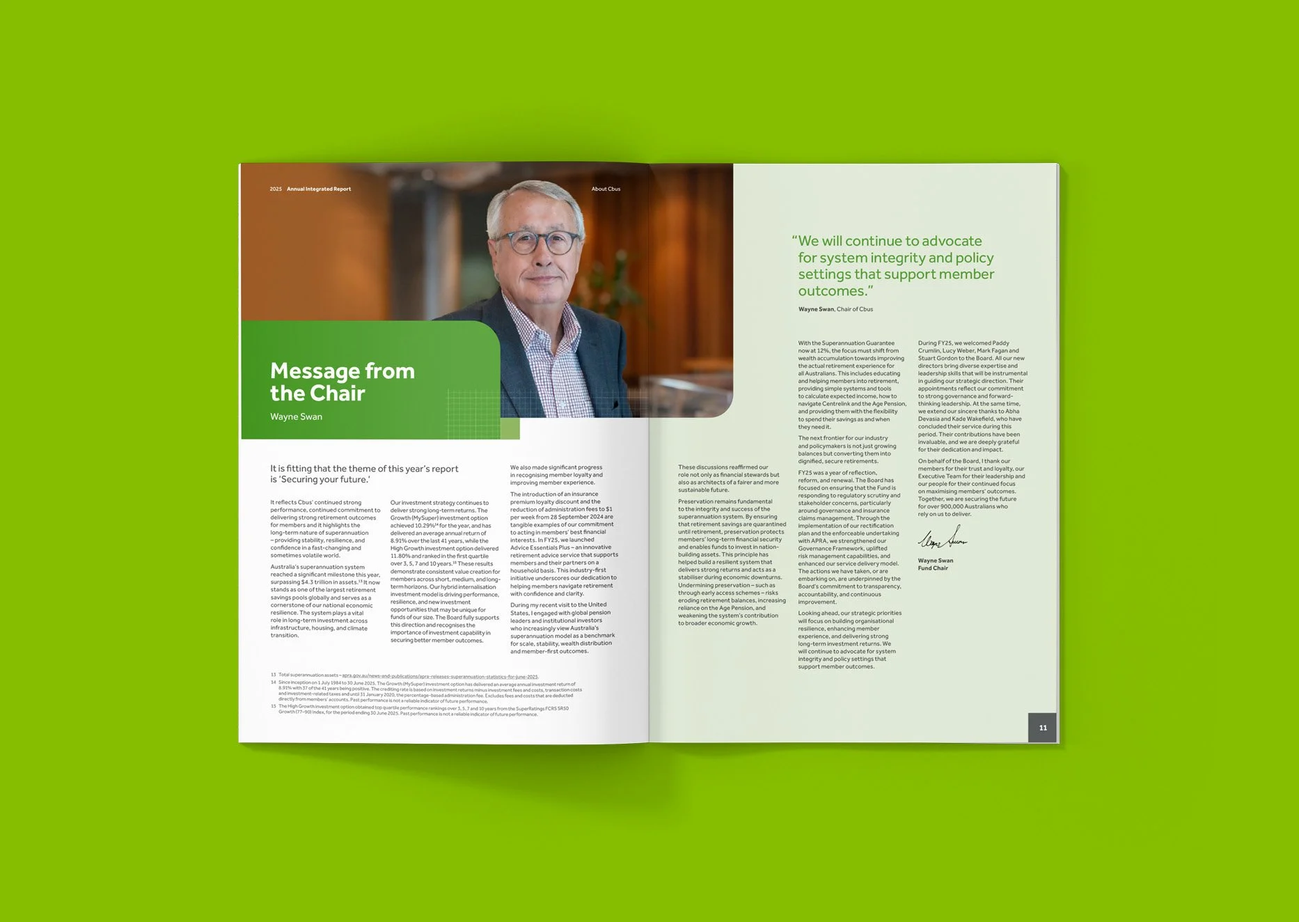
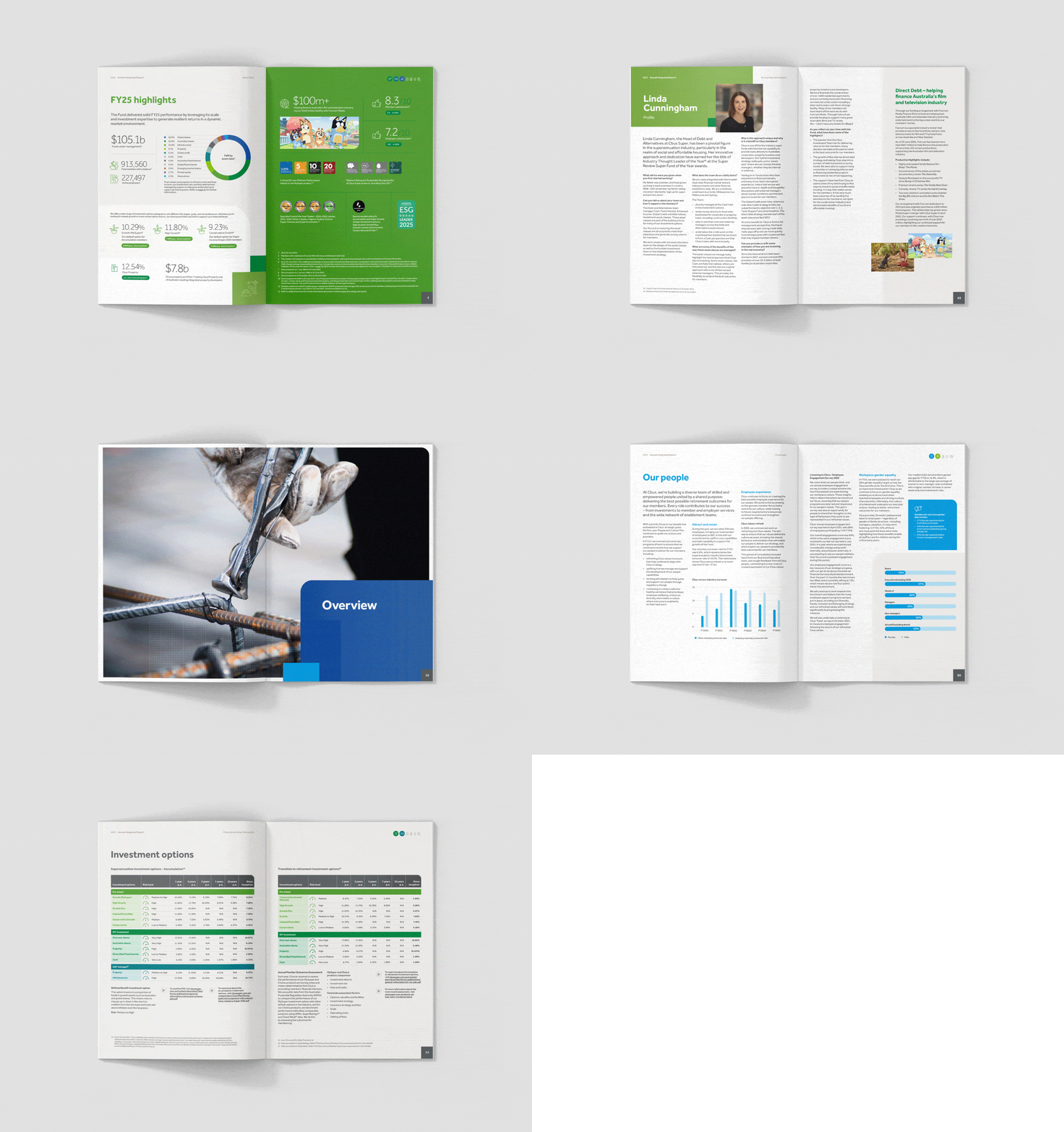
Cbus Reporting Suite
This project sat within the established rhythms of large-scale corporate reporting, where content was developed by multiple subject-matter experts and supplied in parallel. The full picture only emerged once everything was brought together and tested for structure, flow and balance, creating a fast-moving environment where inputs continued to evolve.
Each document moved through staged submissions, committee reviews and board approvals, often on overlapping timelines. Maintaining momentum without losing cohesion required tight coordination and a system that could absorb ongoing change.
At the same time, the suite needed to balance different roles, with some reports leading visually while others were more compliance-led and content-heavy. The challenge was to create a system that could accommodate both across formats, print and digital, while evolving how the brand showed up in a considered way.
We approached the work as both a system design and delivery challenge, aligning early on structure, hierarchy and priorities before creative development began. This upfront clarity reduced rework and gave the team confidence as content volumes and timelines shifted.
Rather than reinventing the Cbus brand, we refined how it was applied. A modular design system formed the backbone of the suite, bringing consistency while allowing flexibility across documents. Subtle grid references, refined typography and restrained use of colour lifted the overall feel without compromising clarity or accessibility.
The Annual Integrated Report acted as the visual anchor, with more expressive layouts, while other documents applied the system in more functional, content-led ways. This allowed the suite to feel cohesive without becoming repetitive.
We also extended the visual language through carefully selected working-context imagery. Close-up, task-focused photography of members added authenticity and relevance, while working within strict representation guidelines.
The result is a cohesive reporting suite where each document fulfils its role while contributing to a system designed to endure across future reporting cycles. The work improves readability of complex information and reinforces trust at a time when clarity matters most.
Just as importantly, the process held up under pressure. Despite shifting timelines and overlapping approvals, the system provided a strong foundation that allowed updates and sequencing changes without losing cohesion.
Brand Development
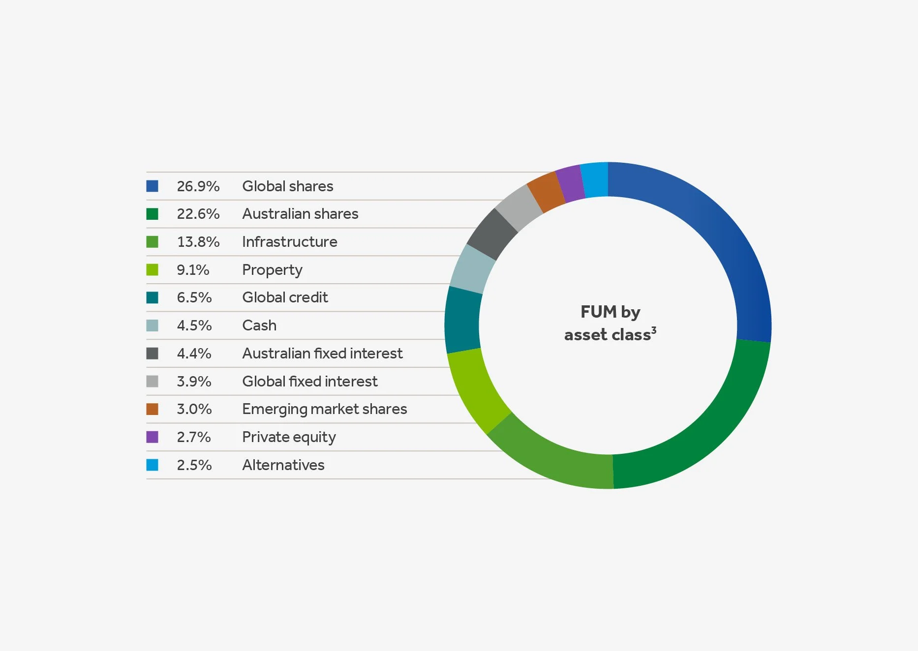
Infographics
Publication
Print Production

“The refreshed design system fundamentally lifted how the Cbus reporting suite looked and felt, making complex regulatory content clearer while remaining recognisably Cbus. The strong foundation meant that when reporting timelines inevitably shifted, Studio Hoopla was able to accommodate updates and sequencing changes across the suite of reports without losing cohesion.”
Catherine Buckmaster, Senior Manager
Corporate Reporting Strategy & Corporate Affairs at Cbus