Alceon
As Alceon’s investment capabilities grew, the brand struggled to keep pace. We partnered with the team to sharpen the master brand and align teams through a unified visual and digital system built for growth.
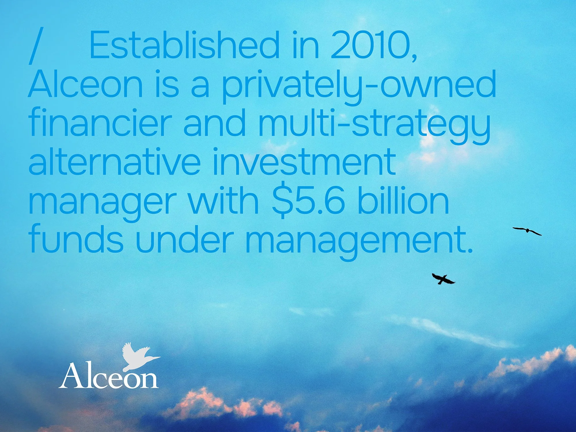
Alceon is a fast-growing private capital investment firm operating across real estate, private equity and hybrid solutions. Combining institutional-grade discipline with a highly hands-on, partnership-led approach, Alceon invests alongside clients and stays closely involved through every stage of the investment lifecycle.

Alceon Brand Refresh, Collateral & Website
Growth is a good problem to have, but it can create brand headaches fast.
Individually, each team at Alceon was striding ahead. From a brand perspective, the business was starting to fragment, with different teams approaching brand and design in different ways. This created a risk that Alceon would appear as a set of disconnected parts rather than a unified investment platform, making it harder for audiences to understand the full breadth and strength of the offer, particularly online.
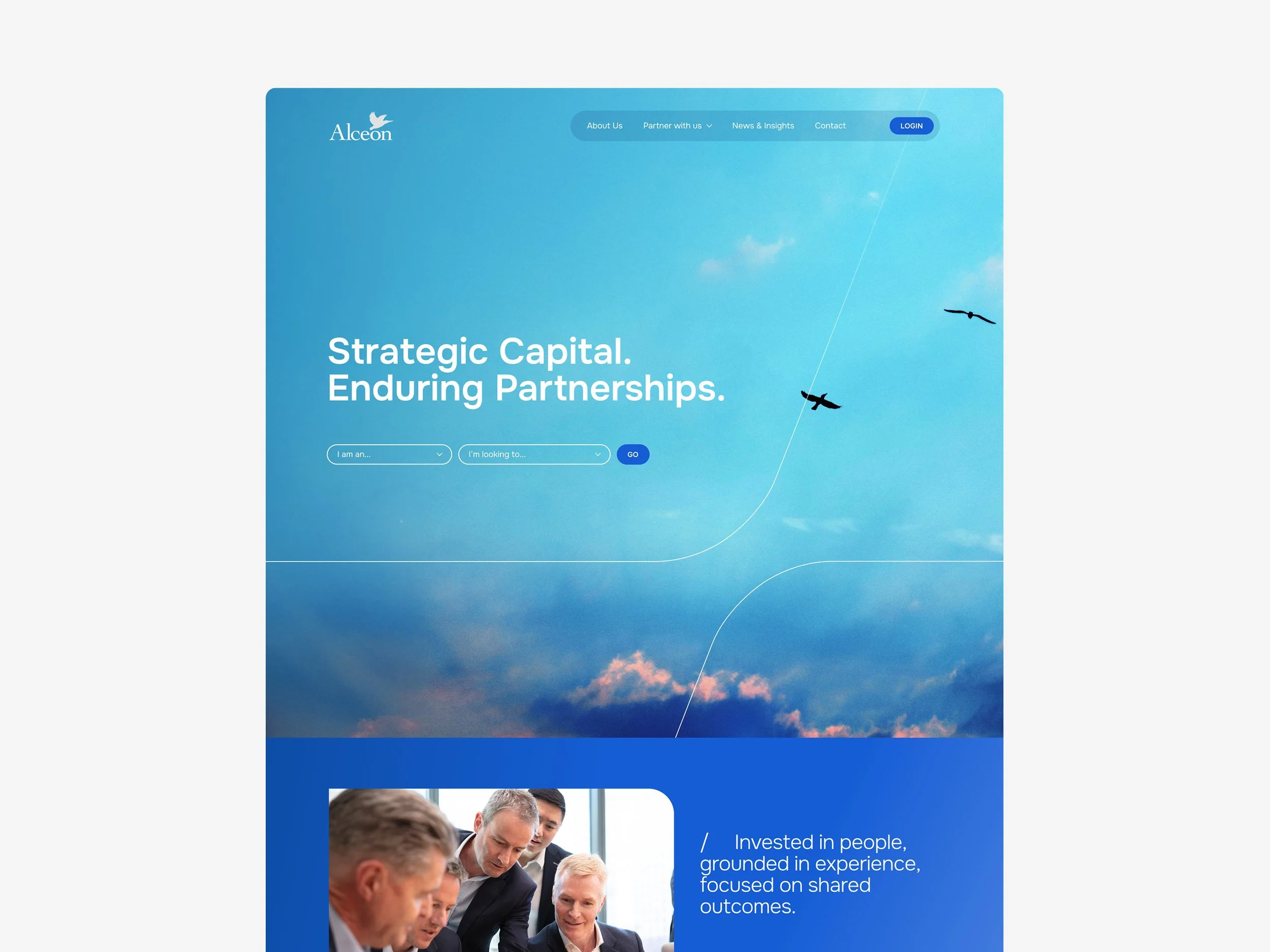
With a new CEO in place and a website overdue for renewal, Alceon reached a pivotal moment. The challenge was to unify the brand and move away from a generic investment aesthetic, creating a clearer, more distinctive presence that better reflects the calm confidence and partnership-led nature of the business.
We began by getting to know the business and its people, then getting the foundations right. Through a focused brand strategy and tone of voice, we created clear guardrails around positioning, audiences and how Alceon should sound in words. This alignment phase was critical, giving the leadership team shared language, sharper decision-making and confidence that future choices would be anchored in strategy, not personal preference.
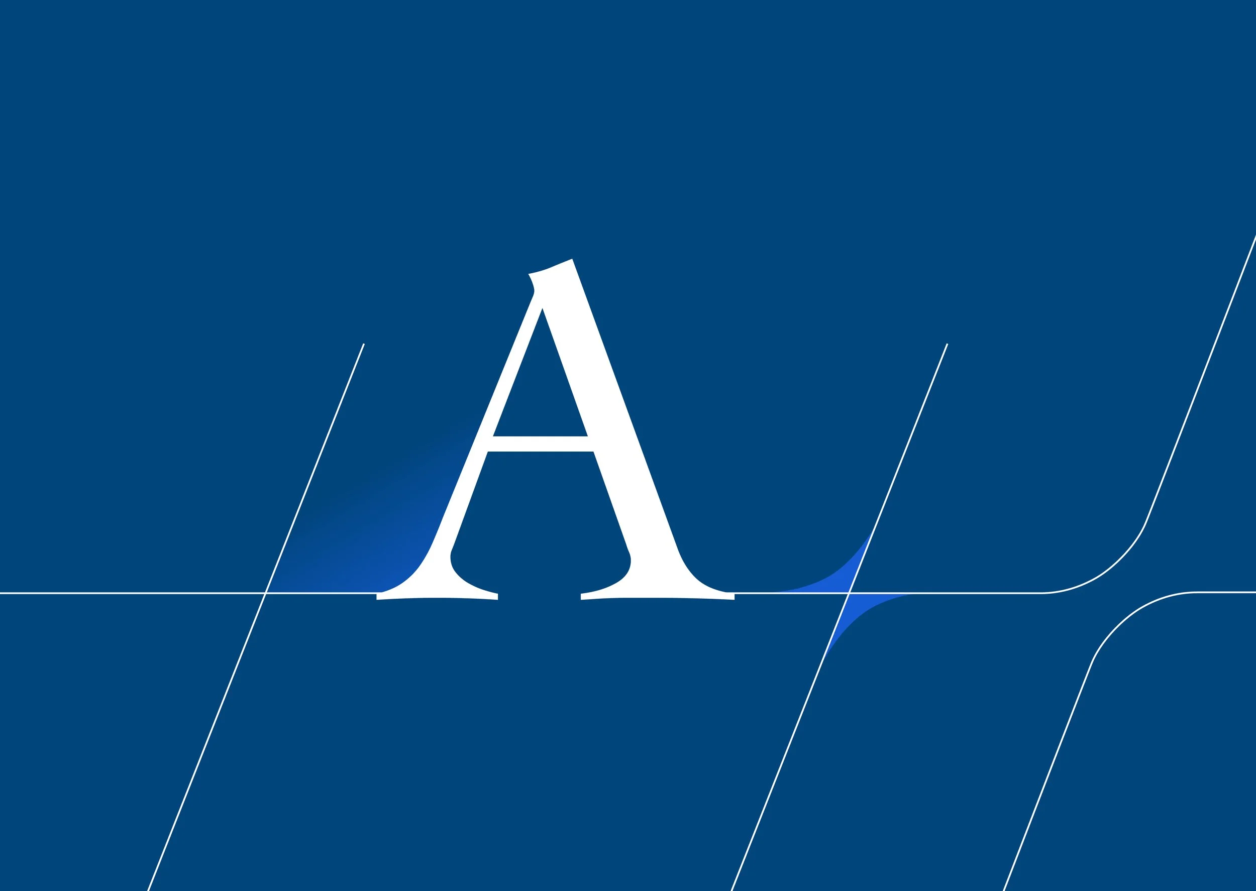
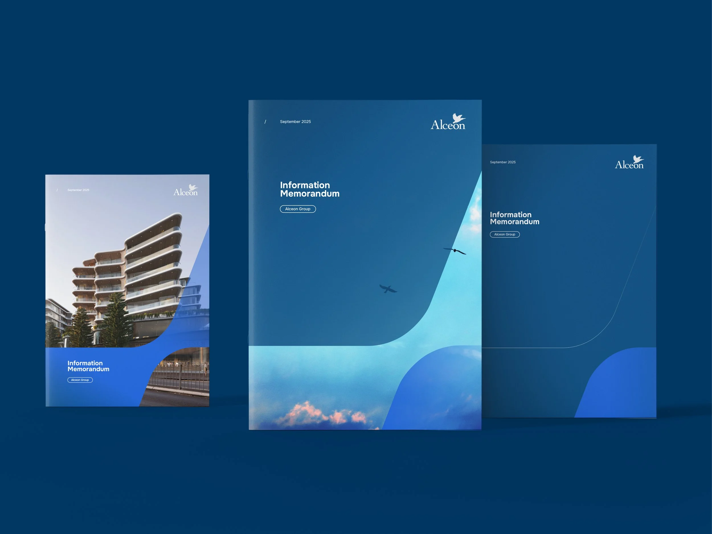
From there, the visual identity became the turning point. Drawing on the meaning behind Alceon’s name — rooted in halcyon and symbolised by the kingfisher — we developed a visual language that feels uniquely theirs and expresses calm, alignment and forward momentum. Atmospheric skyscape imagery, refined typography and considered graphic devices came together to create a brand that feels confident without being loud, and distinctive without trying too hard. For the Alceon team, this was the moment strategy became tangible.
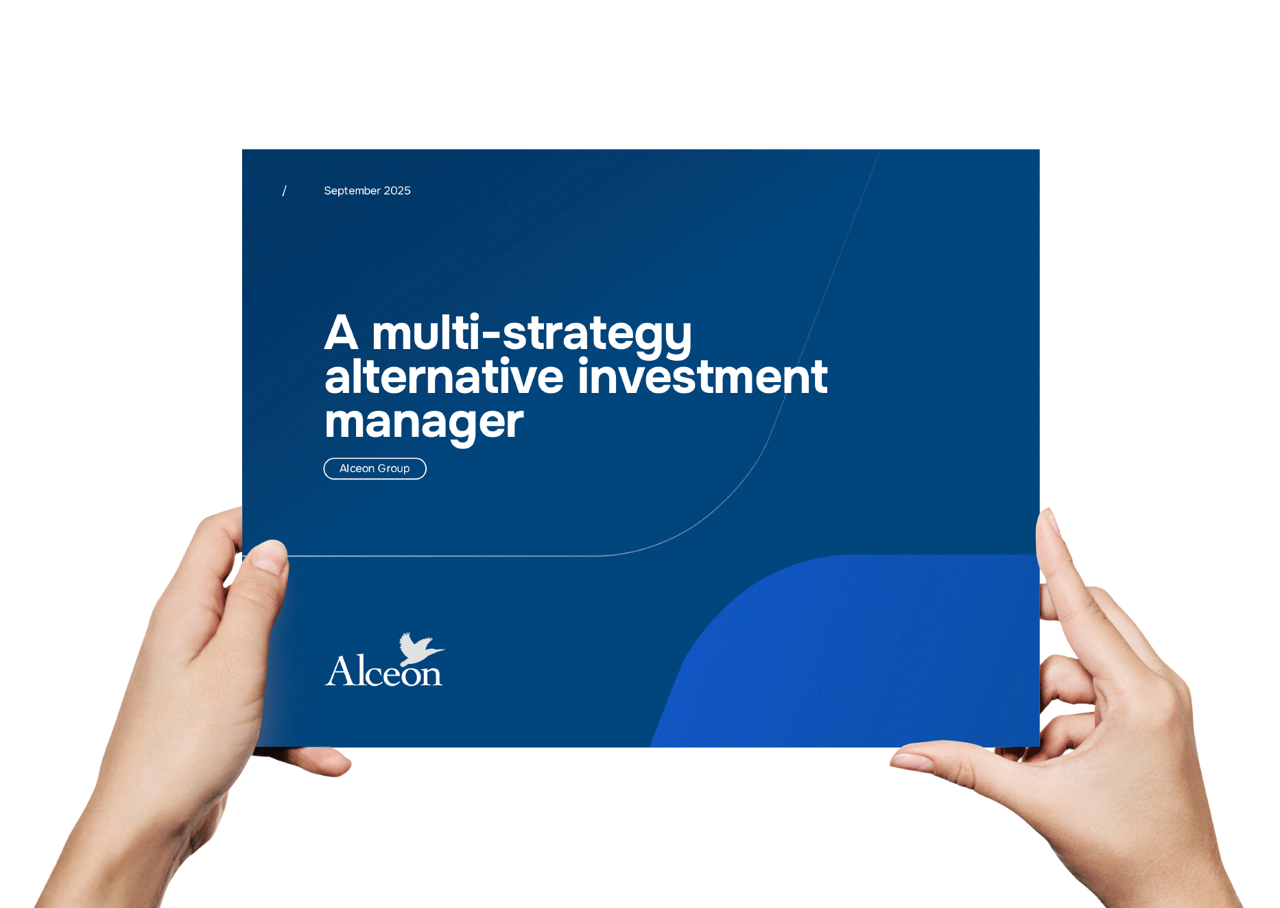
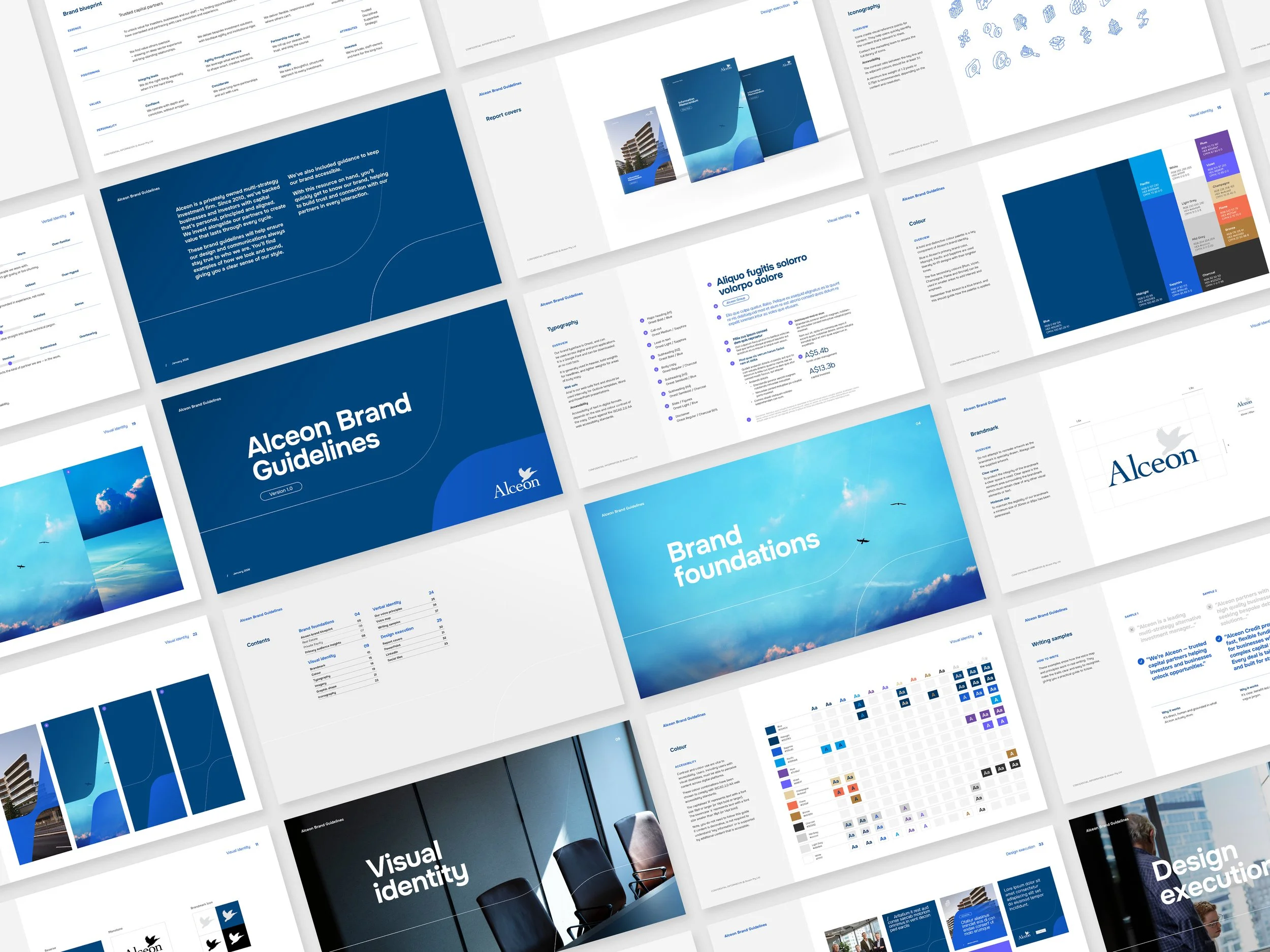
With the identity locked in, we rolled it out across Alceon’s priority materials, from pitch decks and reports to LinkedIn assets, Word templates and stationery. The focus here was practicality: building a system that supports speed, consistency and confidence in day-to-day use, while reducing friction across teams.
The final and largest piece was the website. We led the structure and content, bringing the strategy and identity to life in a calm, confident digital experience that translates a complex investment business into clarity. Once the creative direction was set, we handed the project over to Alceon’s development partner, Walter Wakefield, to translate the designs and build the website.
Brand Strategy
Brand Identity
Website
Copywriting
Collateral
Digital Assets
Print Production


Alceon now has a unique master brand that leads every capability — supported by practical tools and a scalable website built for growth. More than a visual refresh, the work reflects how Alceon operates in practice: thoughtful, invested and focused on long-term partnership.
“Studio Hoopla brought genuine rigour to the strategic and creative foundations of our brand. Taking the time to truly understand a complex, multi-capability business including our history and where we're headed before putting pen to paper made all the difference.
The visual identity feels distinctly ours, and the business now has a shared language and clear direction to build from.”
Natalie Jollow, Marketing Director at Alceon