CareSuper
When two likeminded funds unite, it’s more than just a merger—it’s a powerful statement of commitment to their members. More than blending logos and colour schemes, CareSuper and Spirit Super required a brand identity that spoke directly to their members’ hopes and needs.
Both funds had built strong reputations, with deep roots in the communities they served. When the decision to merge was made, they needed a trusted agency partner who understood the significance of this transition. We worked closely with both teams, navigating the complexities of the merger, to create a brand that didn’t just combine their strengths—it amplified them.


CareSuper Brand
Merging two well-established brands came with the significant challenge of ensuring member retention and bringing both CareSuper and Spirit Super members on the journey. With Spirit Super members having already experienced multiple mergers, it was crucial to reassure them that this transition would strengthen their fund rather than disrupt it. Beyond retention, the secondary challenge was crafting a unified brand that could also attract new audiences in an increasingly competitive market.
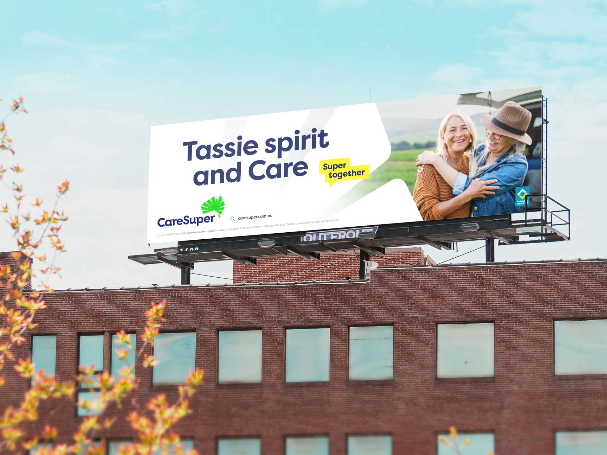
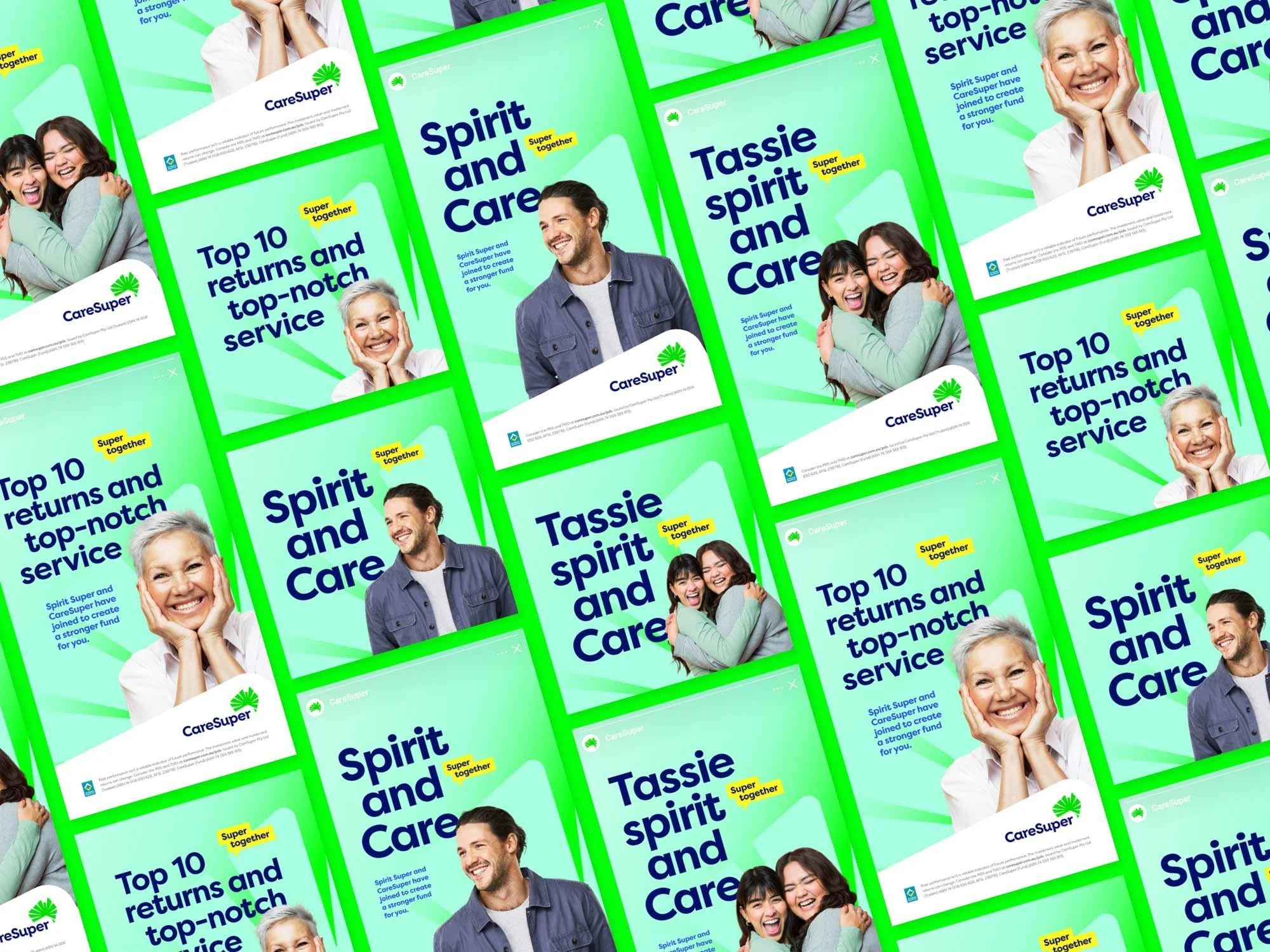
Our approach began with a deep dive into what made CareSuper and Spirit Super unique. We didn’t just want to blend their identities; we wanted to create a brand that felt inevitable—a natural evolution that both sets of members could rally behind. We revisited every aspect of their existing brands, from the visual elements to the core messaging, ensuring the new brand would feel fresh and familiar. The idea of “Super Together” became our guiding principle, a simple yet powerful concept that spoke to the strength found in unity. This wasn’t just about marketing; it was about creating a story that members could believe in.
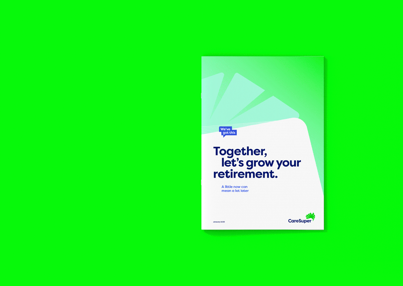
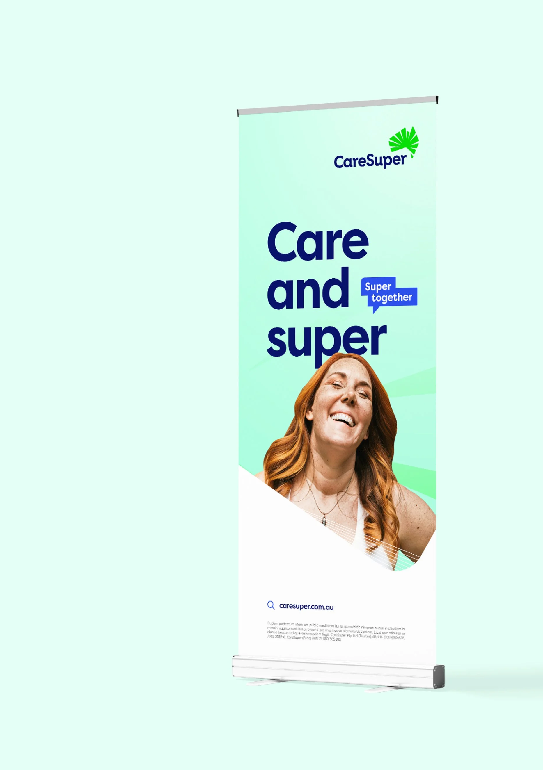
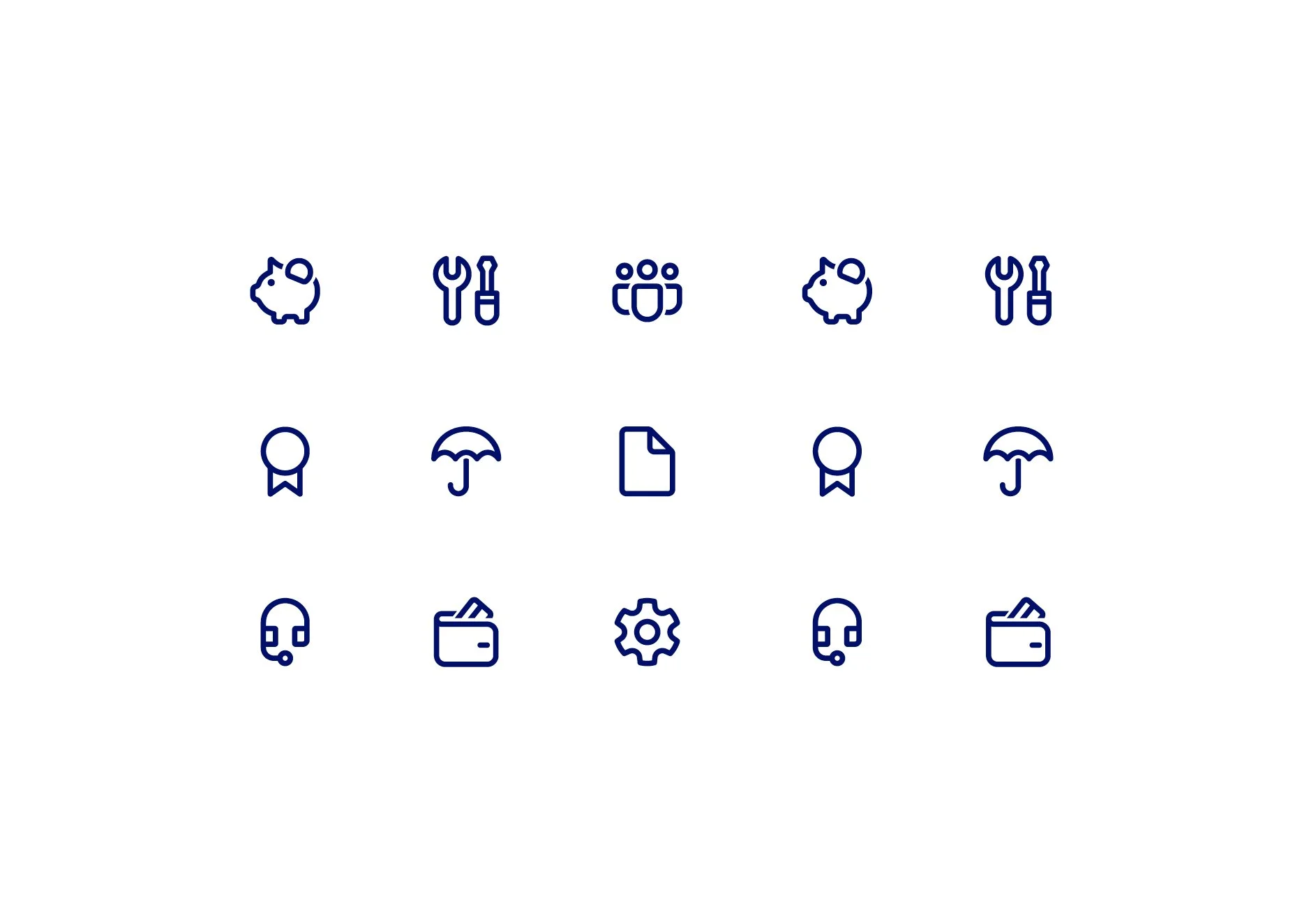
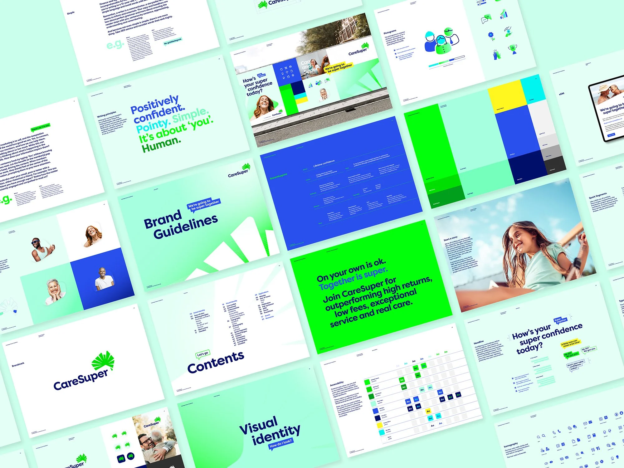
Visuals and voice were crucial in making this merger feel seamless. We created a visual identity that was fresh, vibrant, and full of life—symbolising the energy and optimism of the new fund. The tone of voice was equally important; it needed to be warm, approachable, and confident, reassuring members that they were still in safe hands. Our design choices, from the bold typography to the bright colour palette, were crafted with a digital-first focus, ensuring the brand would excel across online platforms where most interactions occur. The result was a brand that felt as if it had always been there, familiar yet exciting, with a clear promise: together, we’re better.
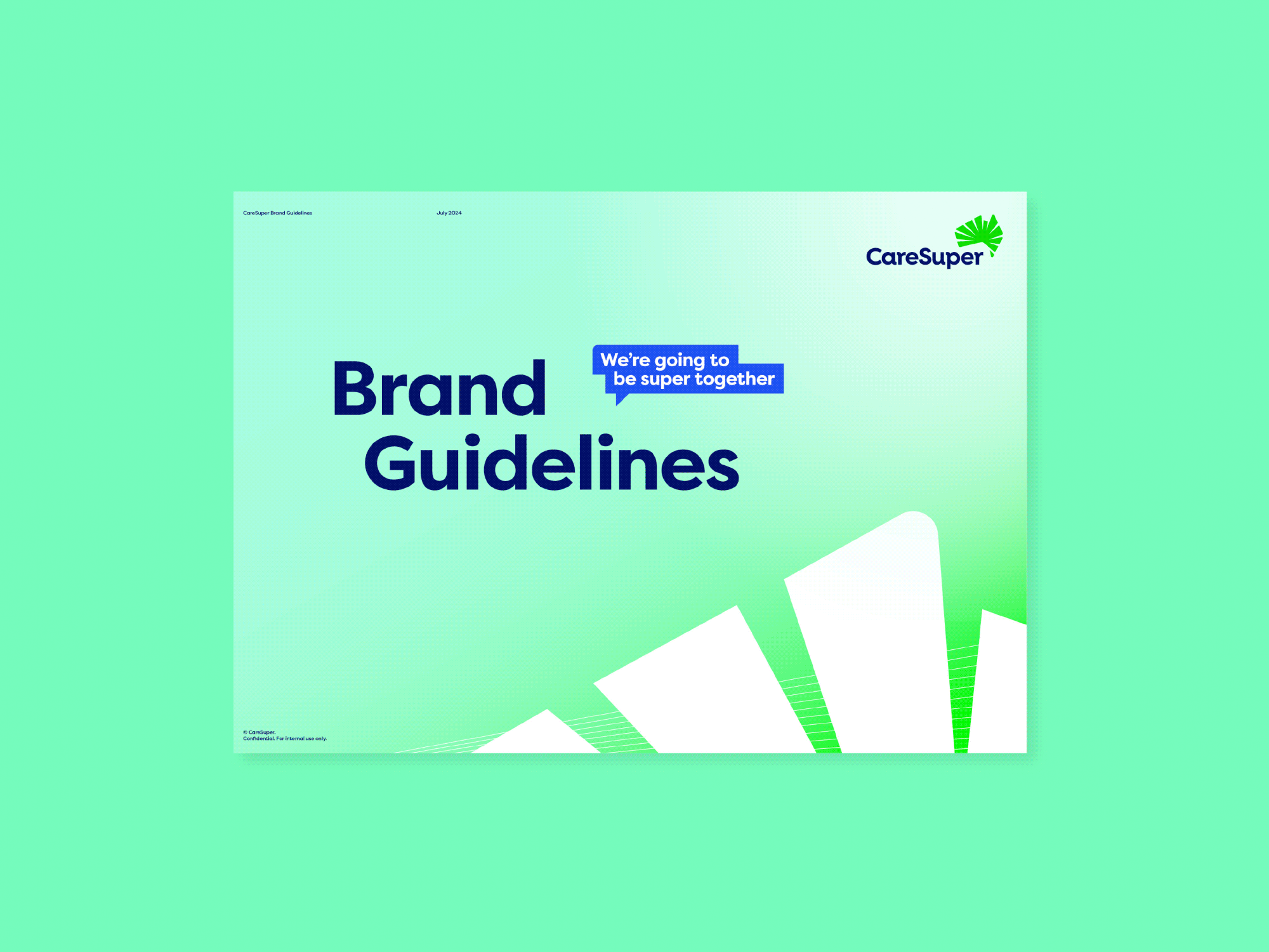
With the new brand in place, consistency was key. We developed comprehensive brand guidelines that served as a blueprint for every piece of communication, from emails to advertising. These guidelines weren’t just about logos and colours—they were about ensuring that every interaction with the brand felt cohesive and true to the story we had created. We also rolled out a suite of collateral that brought the brand to life across various touchpoints, ensuring the transition was smooth for both members and internal teams alike.
As the merger neared completion, we got to work on the launch campaign. This campaign was all about retention—reassuring existing members that CareSuper is still the right choice for them, while also introducing the new brand to the broader public. The “Super Together” message was woven throughout, reinforcing the idea that this was a partnership built on strength and shared goals. The campaign spanned multiple channels, ensuring that no matter where members turned, they were met with a consistent, reassuring message.
The CareSuper and Spirit Super merger was more than just a business decision—it was a promise to their members. Our work helped bring that promise to life, creating a brand that resonates with over 550,000 members and positions the fund for future success. The positive response from members and the broader market validated our approach, proving that when two strong brands come together with a shared vision, the result is truly super.
Awarded Gold at the 2025 Transform Awards ANZ—Best Corporate Brand following a Merger or Acquisition.
Awarded Bronze at the 2025 Transform Awards ANZ—Best Visual Identity from the Financial Services Sector.
Awarded Silver at the BETTER FUTURE Design Awards (Melbourne, Australian & World awards)—Identity and Branding in Finance.
Marketing Strategy
User Research
Brand Identity
Copywriting
Collateral
Campaign
Motion
Illustration
Infographic
Environmental
Publication
Digital Assets
Staff Engagement


We developed comprehensive brand guidelines that served as a blueprint for every piece of communication, from emails to advertising. These guidelines weren’t just about logos and colours—they were about ensuring that every interaction with the brand felt cohesive and true to the story we had created.
“We love working with Studio Hoopla. The way they collaborate and partner with us is something you just don’t get with bigger agencies. Their collaborative approach during the early brainstorming phases made such a difference to the process, and their understanding of the super landscape was a huge plus.”
Susie Stephenson, GM Engagement and Communications at CareSuper