IDA
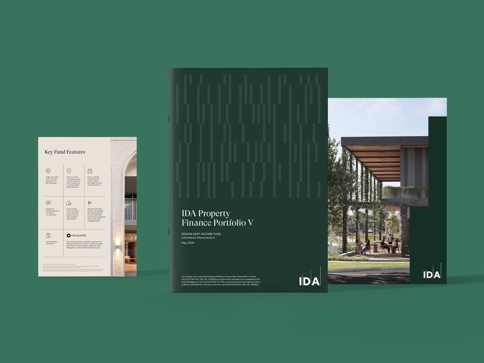
The launch of Property Finance Portfolio V marked a significant step for IDA: its first open-ended fund and an important new offering for the business. We partnered with the team to bring it to market and evolve the brand system for future growth.
IDA is a specialist real estate private credit and investment manager, operating across property finance, capital partnerships and land strategies. Known for its disciplined approach to underwriting and deep property insight, the business serves wholesale investors, advisers and institutional allocators.



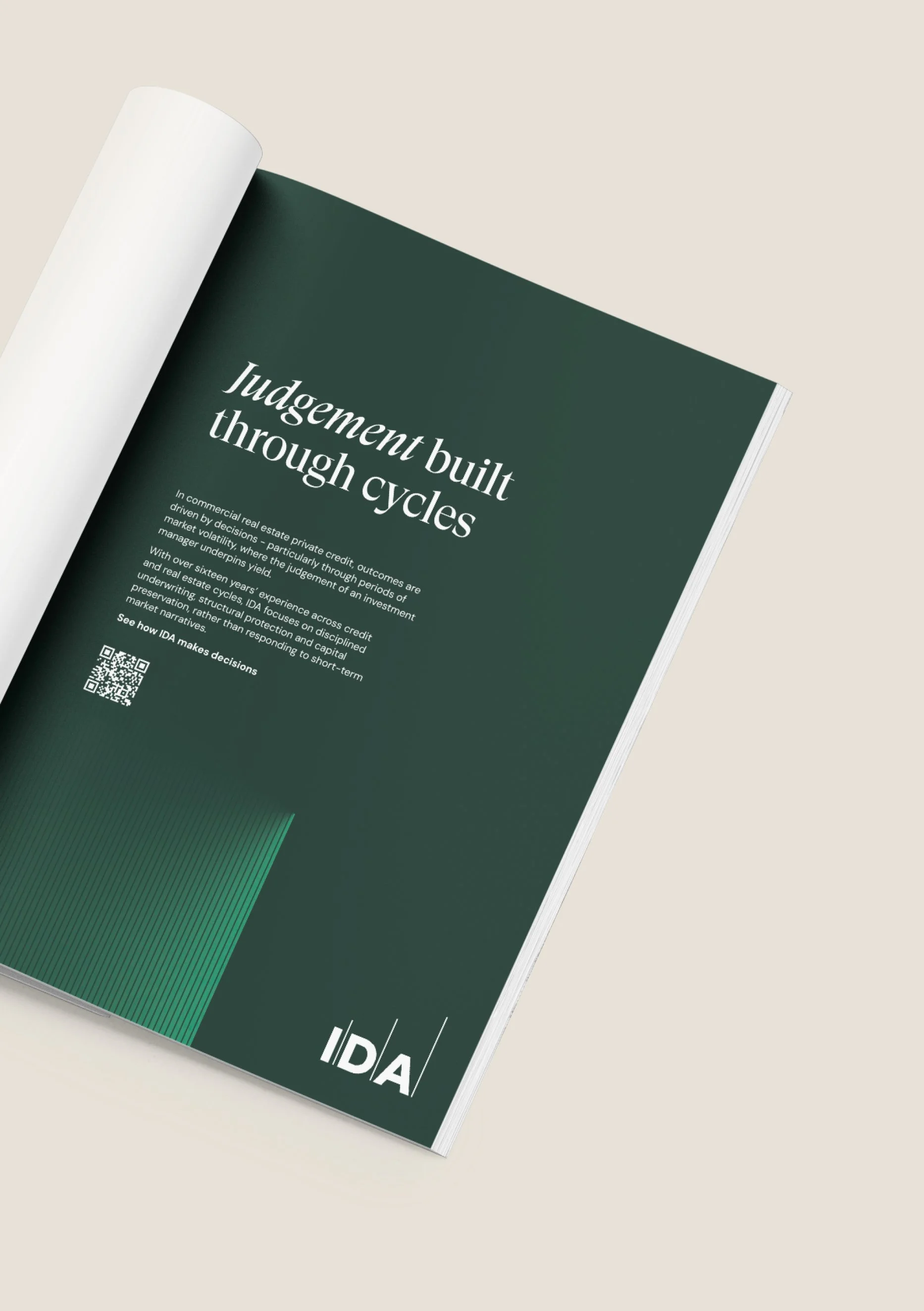
IDA Brand Development & First Mortgage Fund Launch
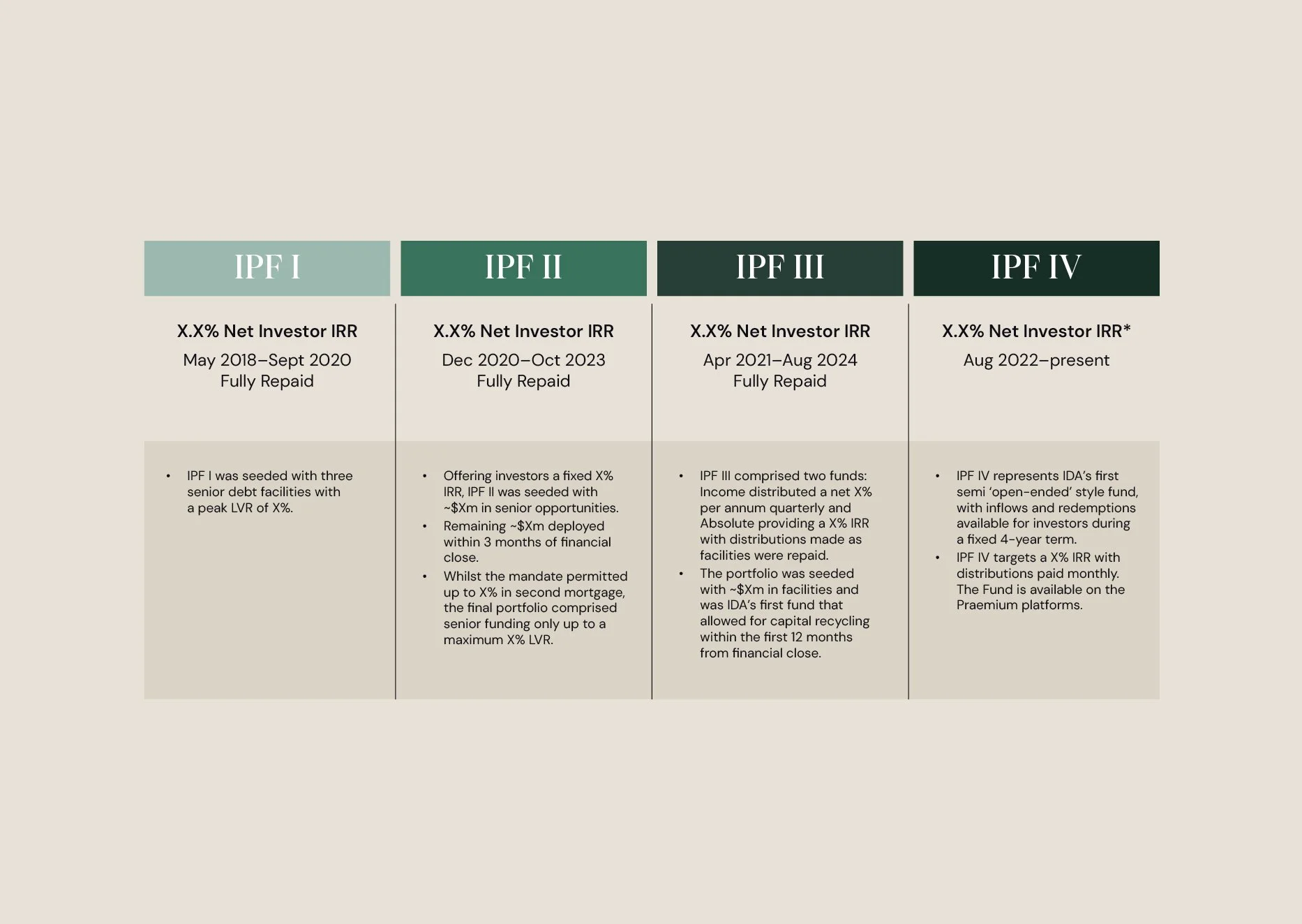
The First Mortgage Fund built on four previous closed-end funds, opening a proven IDA strategy to a broader range of investors. The fund had a deliberately disciplined proposition: pure first mortgage lending, conservative risk settings, clear liquidity and a strong focus on capital protection.
At the same time, the IDA brand itself was evolving. The foundations were strong, but the way it presented across materials and campaigns lacked consistency. The launch created an opportunity to strengthen the brand without starting again, expanding the existing system with new visual tools that could support the business as it grew.
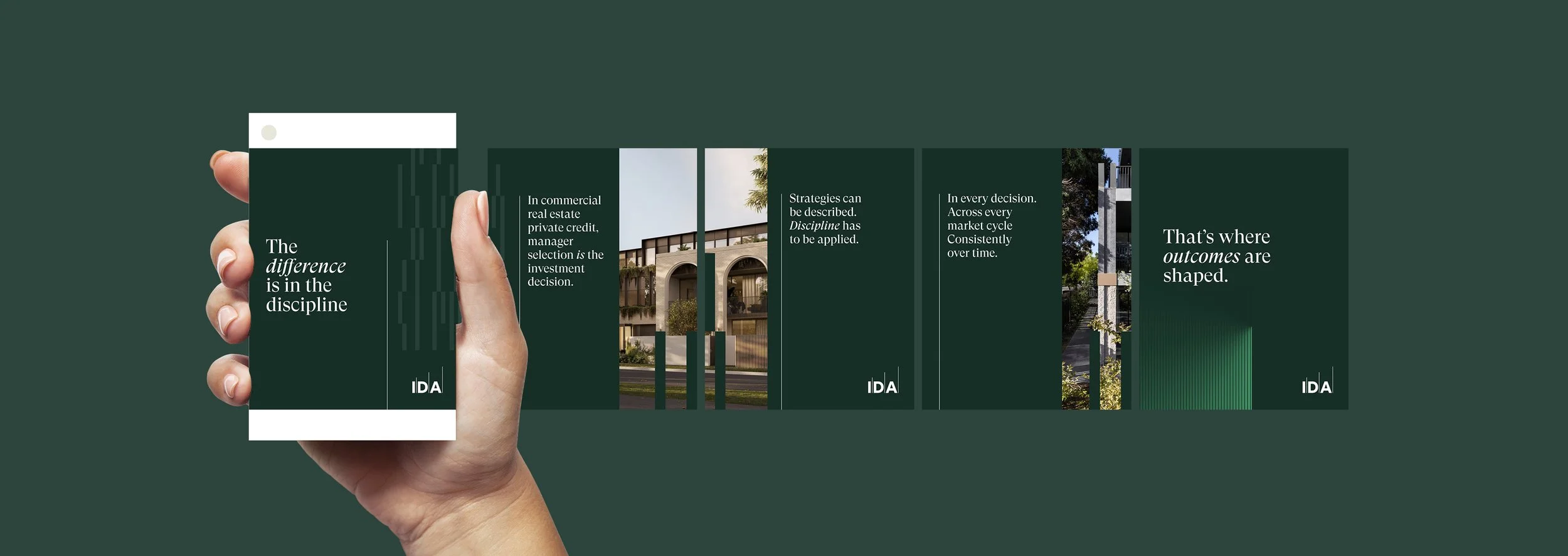
First, we worked with IDA to define a clear campaign platform. Early concepts explored different angles, such as structure, experience and category-level messaging, but risked feeling fragmented. We brought these together under a single unifying idea: “The difference is in the discipline.”
At a brand level, it positioned IDA as a manager defined by what it does, not what it says. From there, we translated this thinking into a cohesive visual and communication system.
Rather than reinventing the brand, we refined and extended it. The logo, typography and core colour palette were retained, while we clarified the colour hierarchy and expanded the visual language to make the system more distinctive, flexible and easier to use day-to-day.
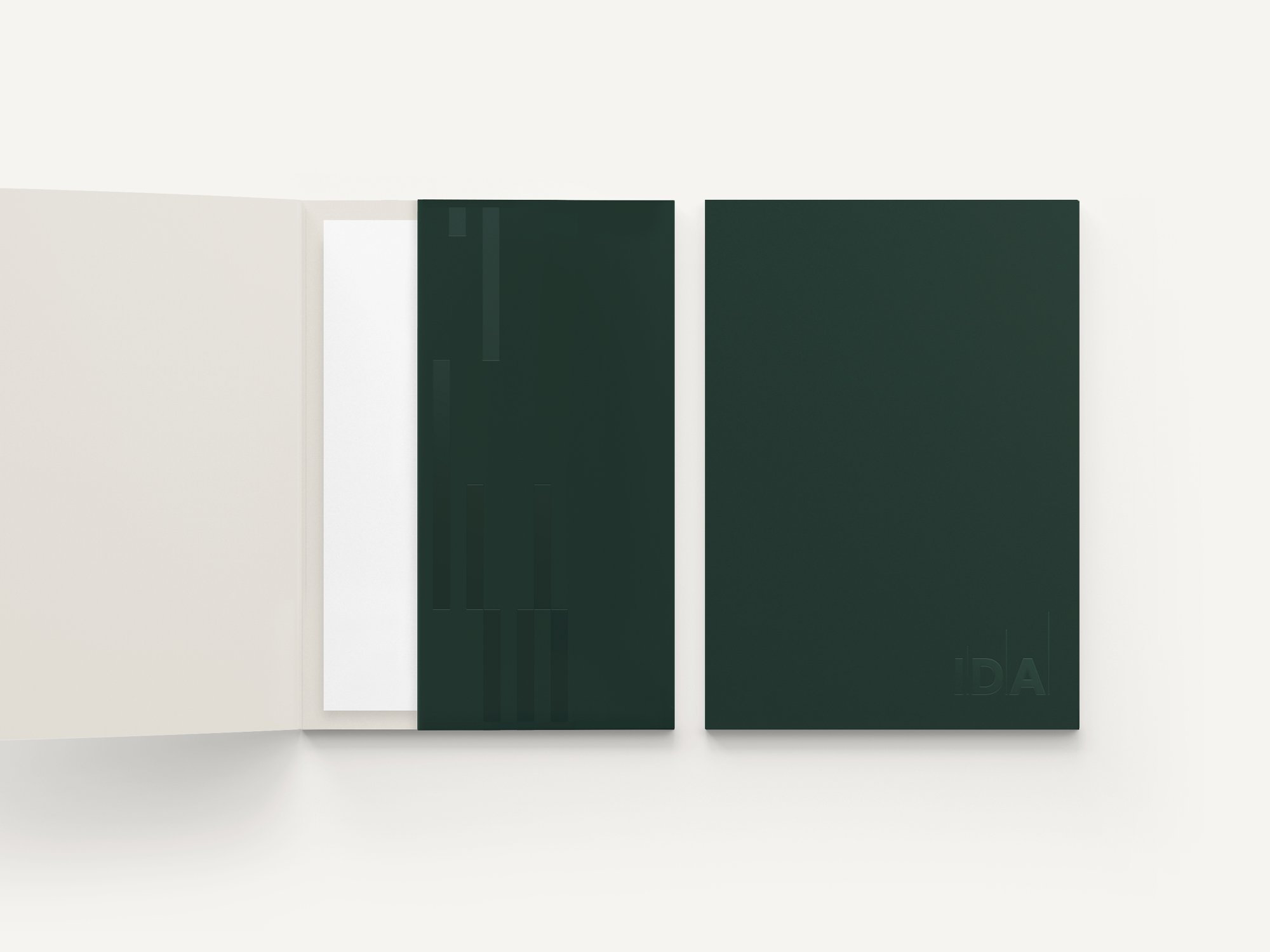
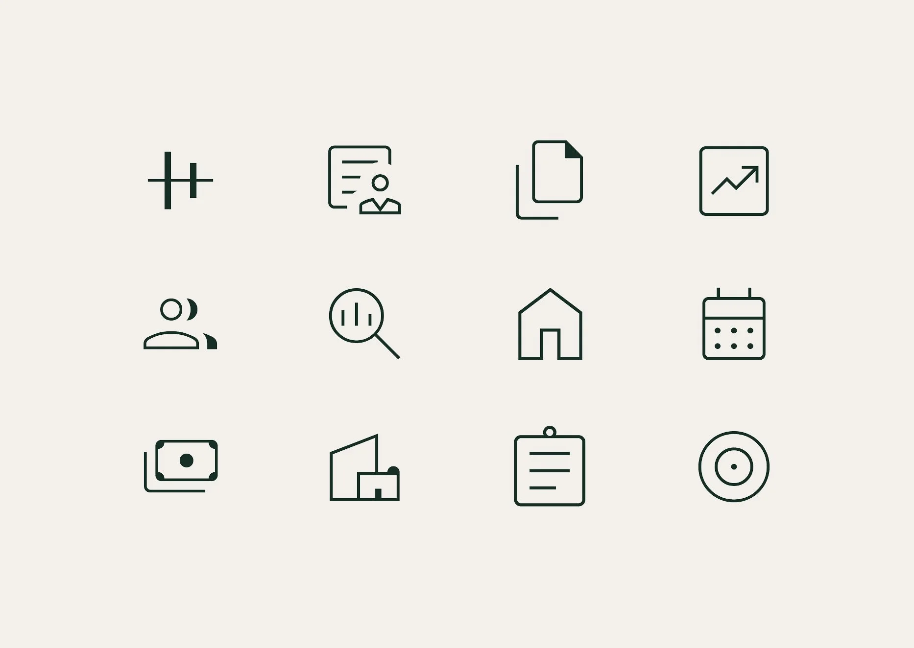
The logo’s strong verticals inspired a building-block pattern: an ownable graphic device that could work as a fine detail or at large scale. From the same fine-line language, we developed an abstract graphic treatment that gave the team another flexible tool to work with. We also opted for a Google icon suite, giving IDA’s small marketing team an extensive, easy-to-access library that could be used consistently without needing to create bespoke icons each time.
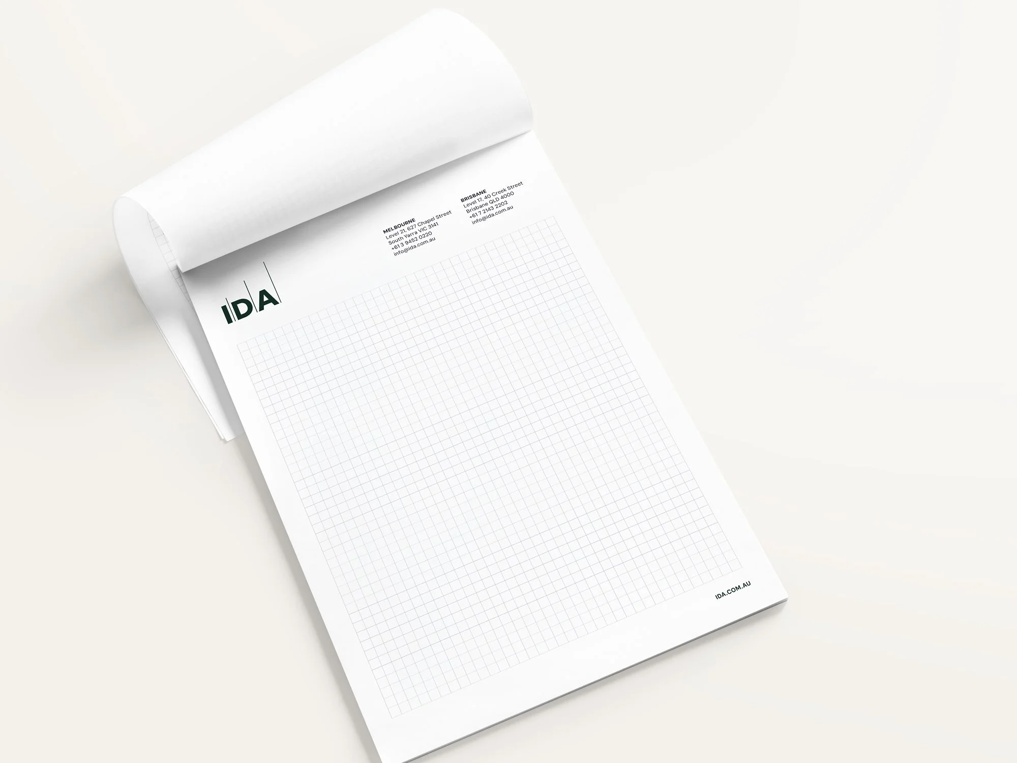
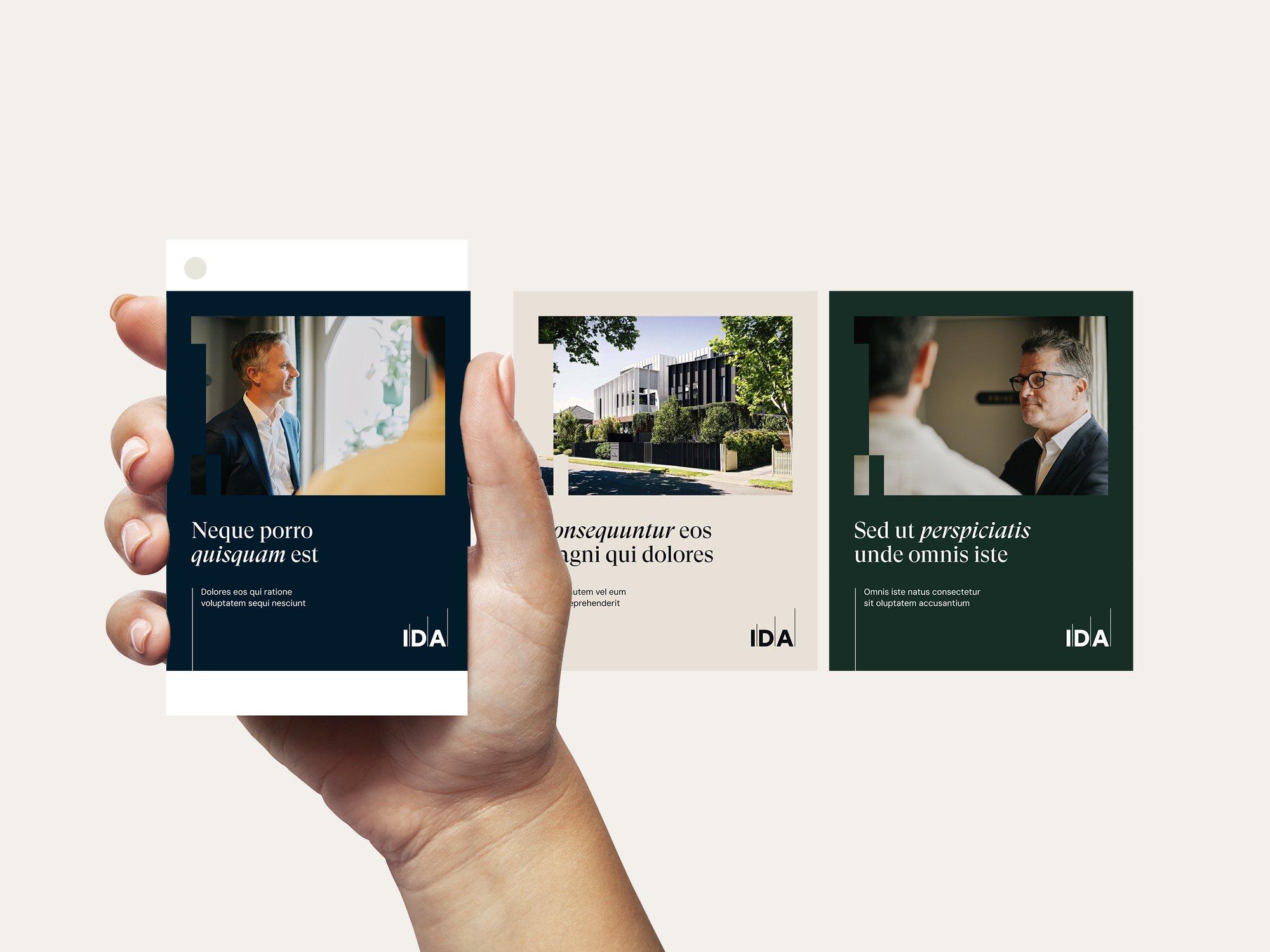
That system carried across the full suite of launch materials: a 40-plus page Information Memorandum, fact sheet, pitch deck, presentation folder, video assets and social templates. Wherever practical, assets were delivered as self-serve templates for IDA’s marketing team.
IDA went to market with a clearly differentiated fund and a coherent, credible brand across every touchpoint. Just as importantly, the team was left with a richer, more flexible toolkit to create polished, on-brand communications well beyond the launch.
Brand Development
Campaign
Copywriting
Collateral
Digital Assets
Motion
Print Production
Publication
“Studio Hoopla understood our strategy from the outset and translated it into creative work that consistently hit the mark. Their execution across campaigns, brand assets and the broader brand rollout was exceptional. Seeing everything come together was genuinely impressive, and they proved to be a strategic, dependable partner throughout the process.”
Kate Gunston, Manager, Marketing and Communications at IDA