MaxCap
As MaxCap evolved from a founder-led lender into a leading institutional and wealth investment partner, its brand needed to keep pace. We partnered with the team to evolve the identity and build a brand system that reflected the scale, sophistication and ambition of the business.
MaxCap is a specialist real estate credit and equity investment manager, deploying global capital across Australia and New Zealand since 2007. Backed by a strategic partnership with Apollo Global Management, MaxCap serves institutional and wealth investors.




MaxCap Brand Refresh, Collateral & Website
MaxCap had built a strong reputation, but its brand hadn’t kept pace with the scale and maturity of the business. As the firm evolved into a more institutional player, with global partnerships and a broader investor base, its existing identity and digital presence no longer reflected the depth of its capability. The brand needed to show up with confidence and credibility across every touchpoint, from investor presentations through to the website.
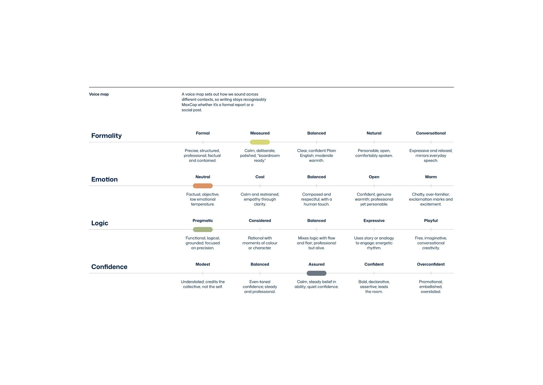
The brief was informed by strategic research from Ground Truth, who had defined a series of positioning territories for the business. Our role was to translate those territories into a compelling visual expression. We developed a series of creative directions, then built the selected direction into a comprehensive brand and design system.
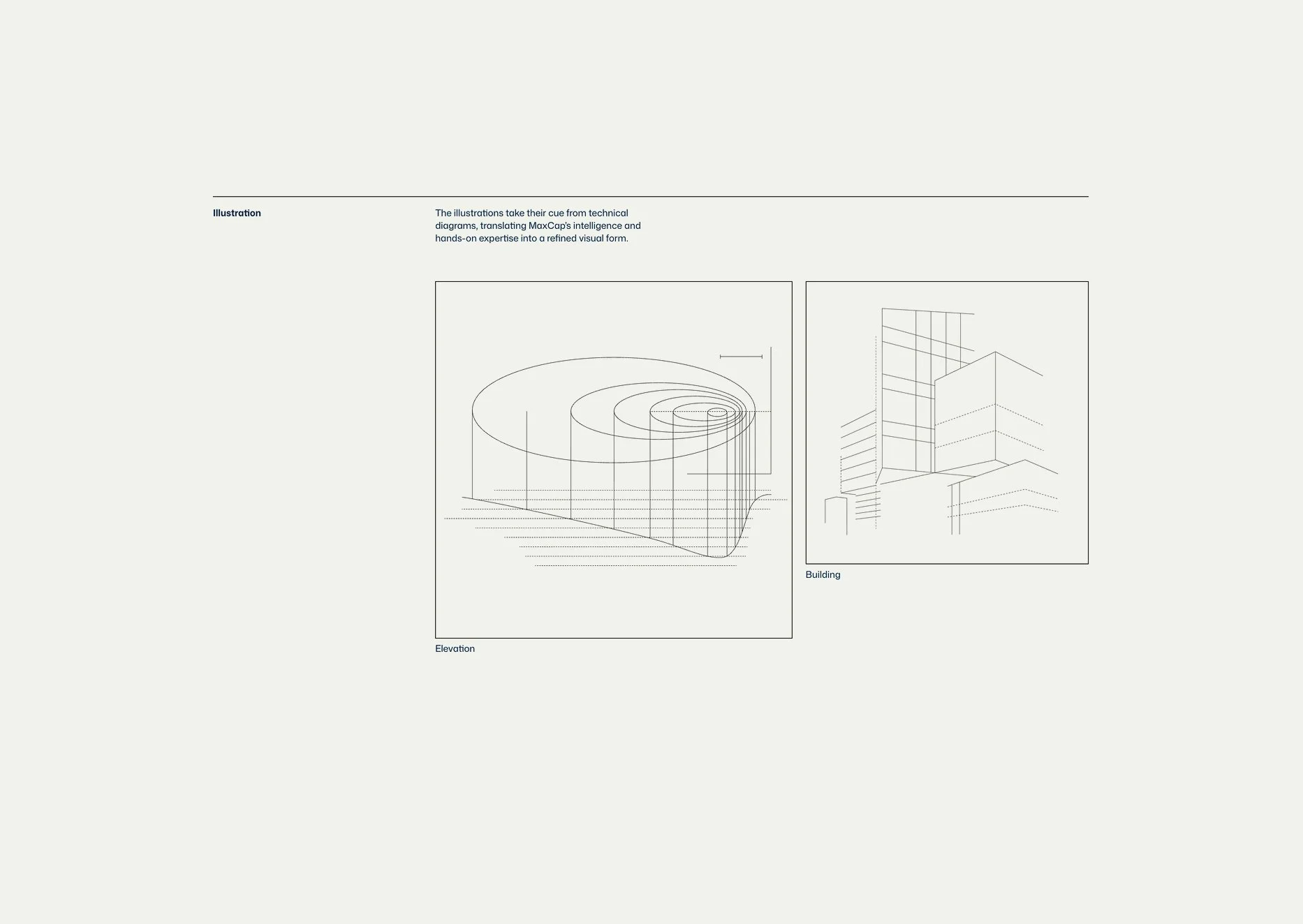
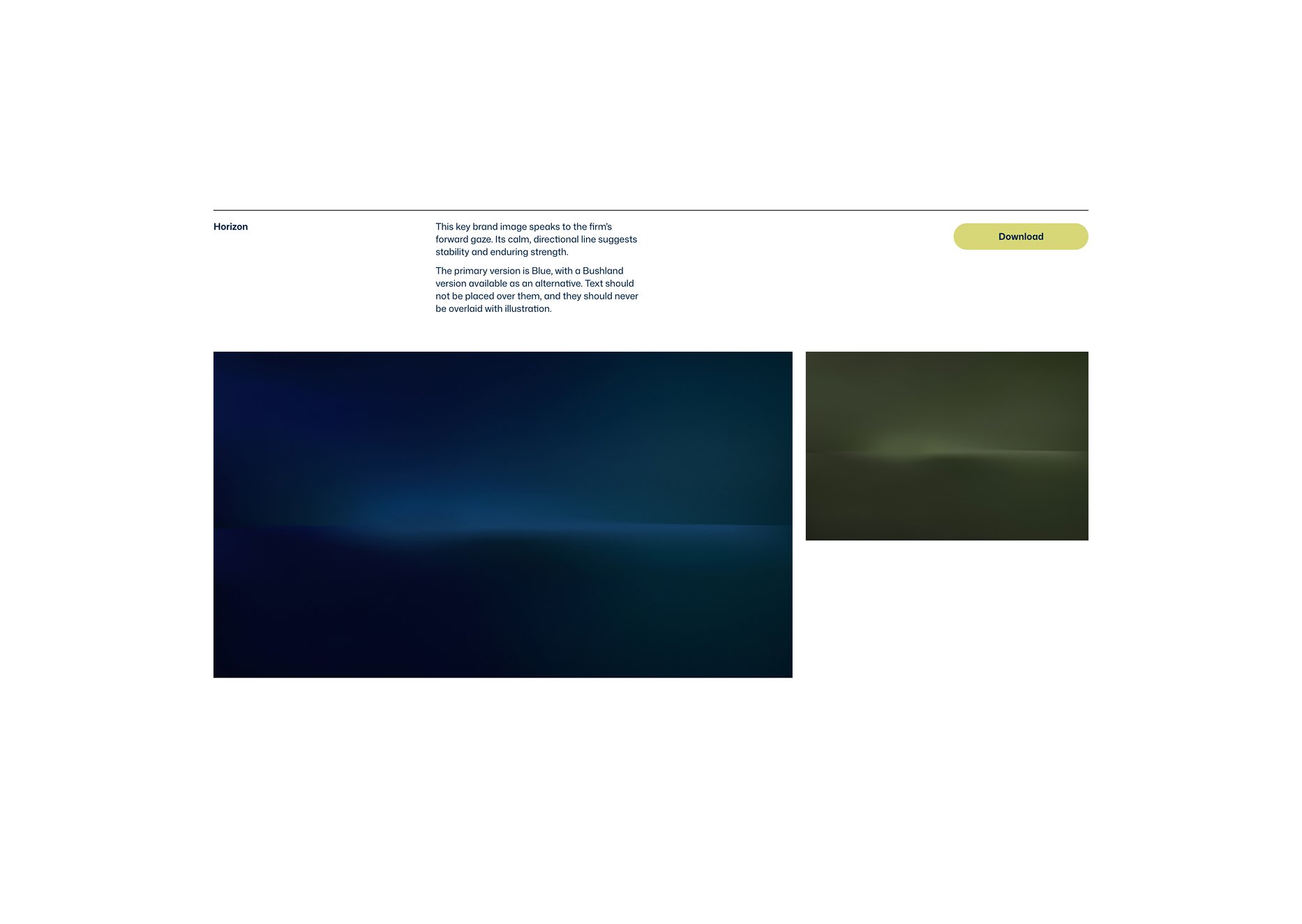
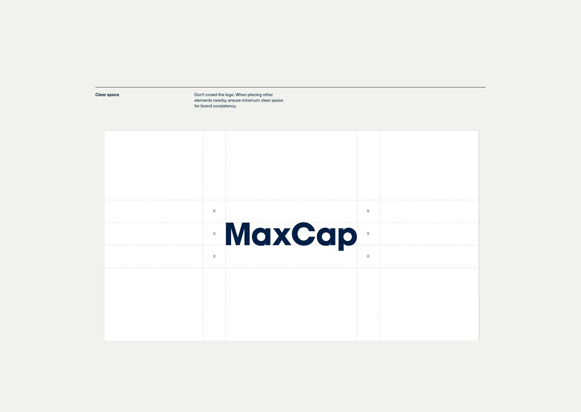
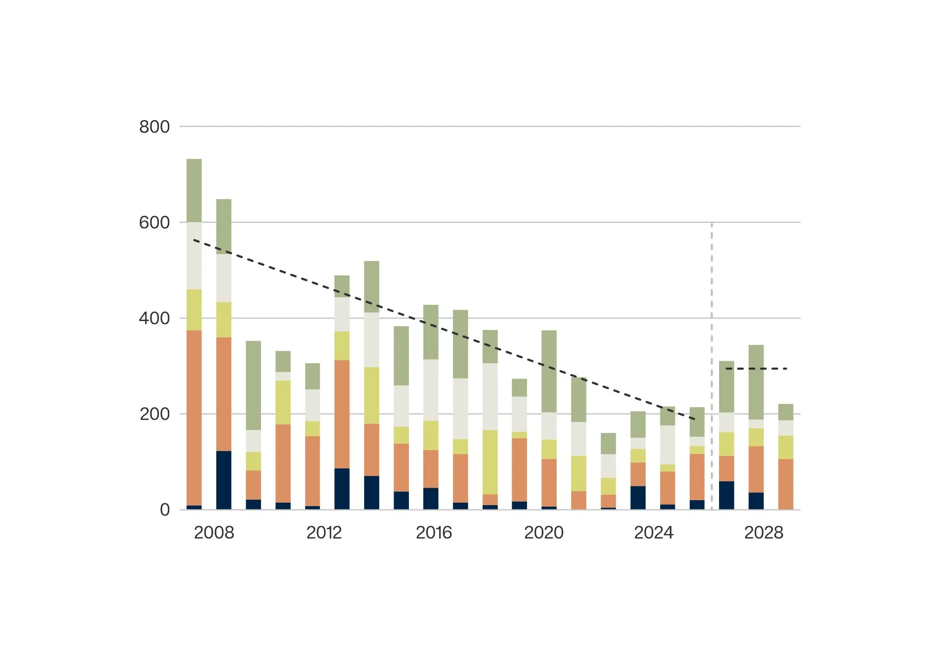
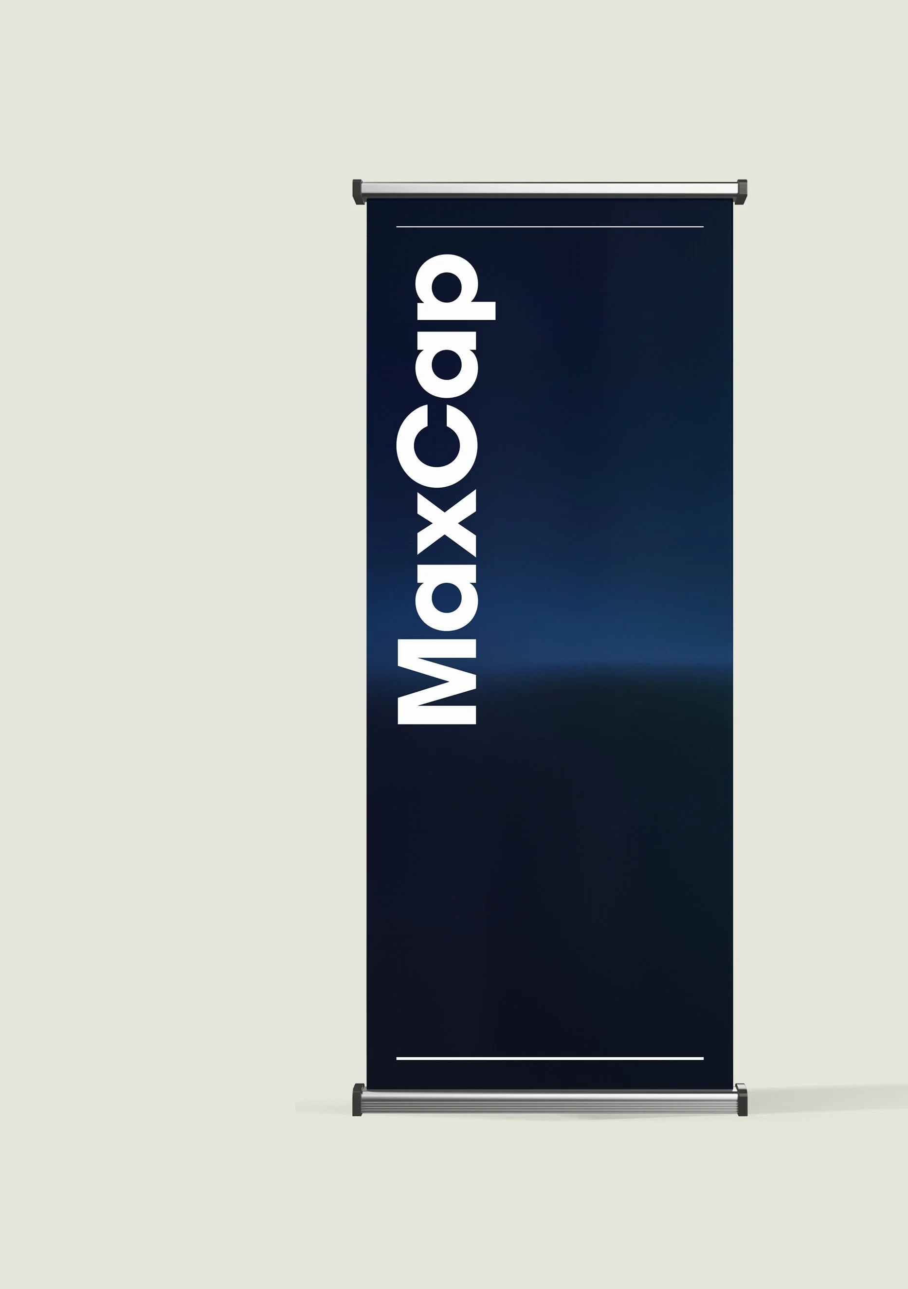
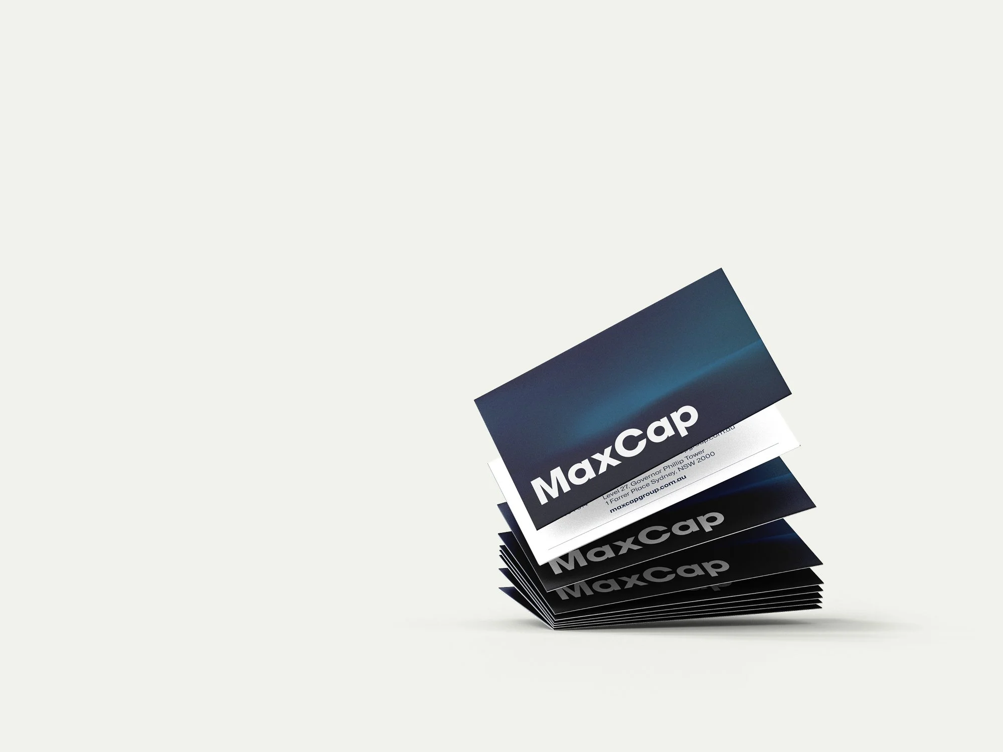
The MaxCap wordmark was retained and simplified, removing unnecessary elements to create a cleaner, more confident presence. An Australian-inspired colour palette gave the brand a distinctive and ownable identity in a global market, while a horizon-line graphic became a recurring device, signalling the forward-thinking perspective and long-term stability at the heart of the business. A suite of technical, diagram-inspired illustrations, complemented by a fine-line icon set, translated MaxCap’s structured approach and hands-on expertise into a distinctive visual language.
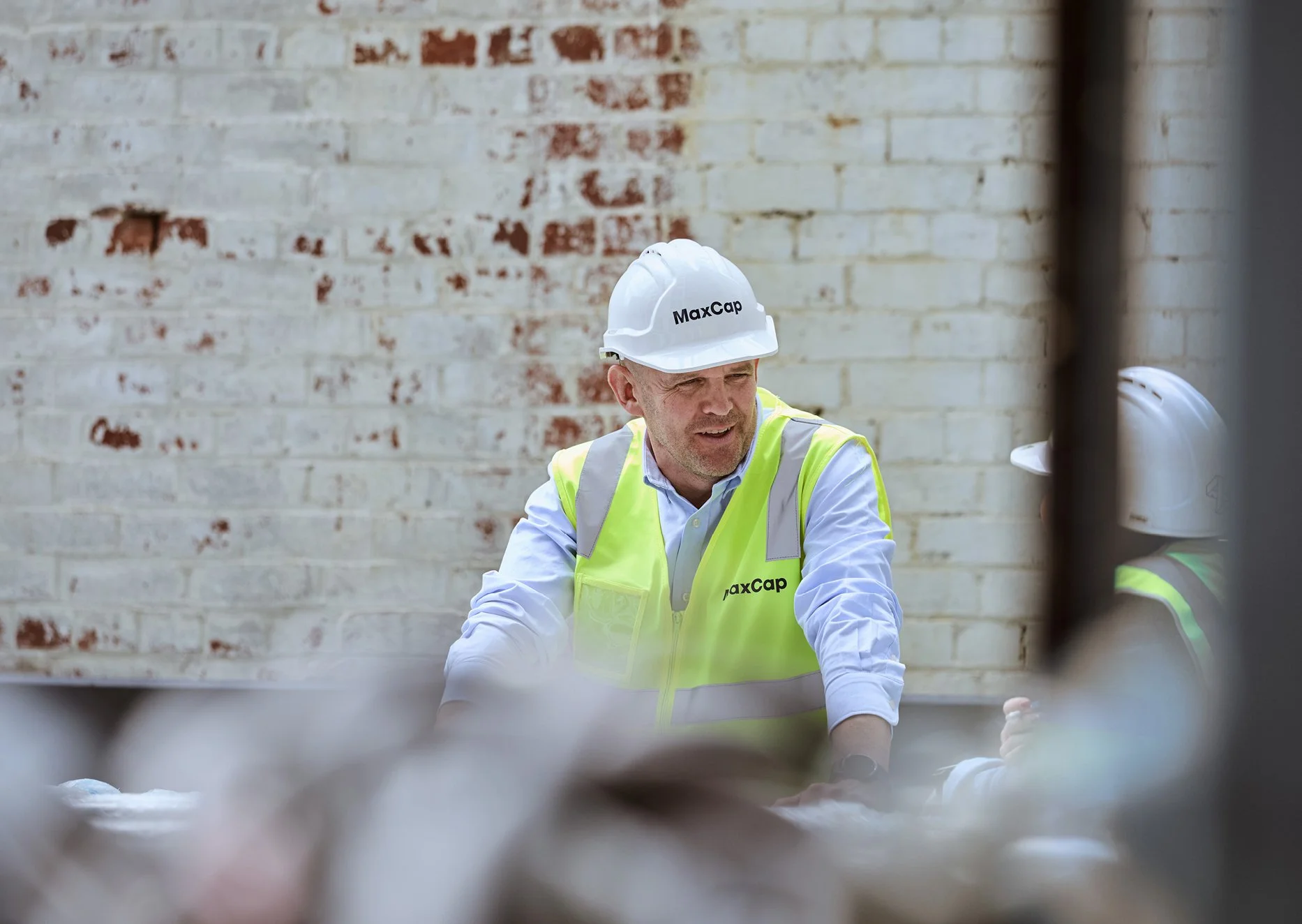
Alongside the identity, we created a custom content library, shooting photography and videography across multiple locations to bring the brand to life through its people. The imagery helped balance institutional credibility with warmth and approachability, putting the expertise and experience behind the capital front and centre.
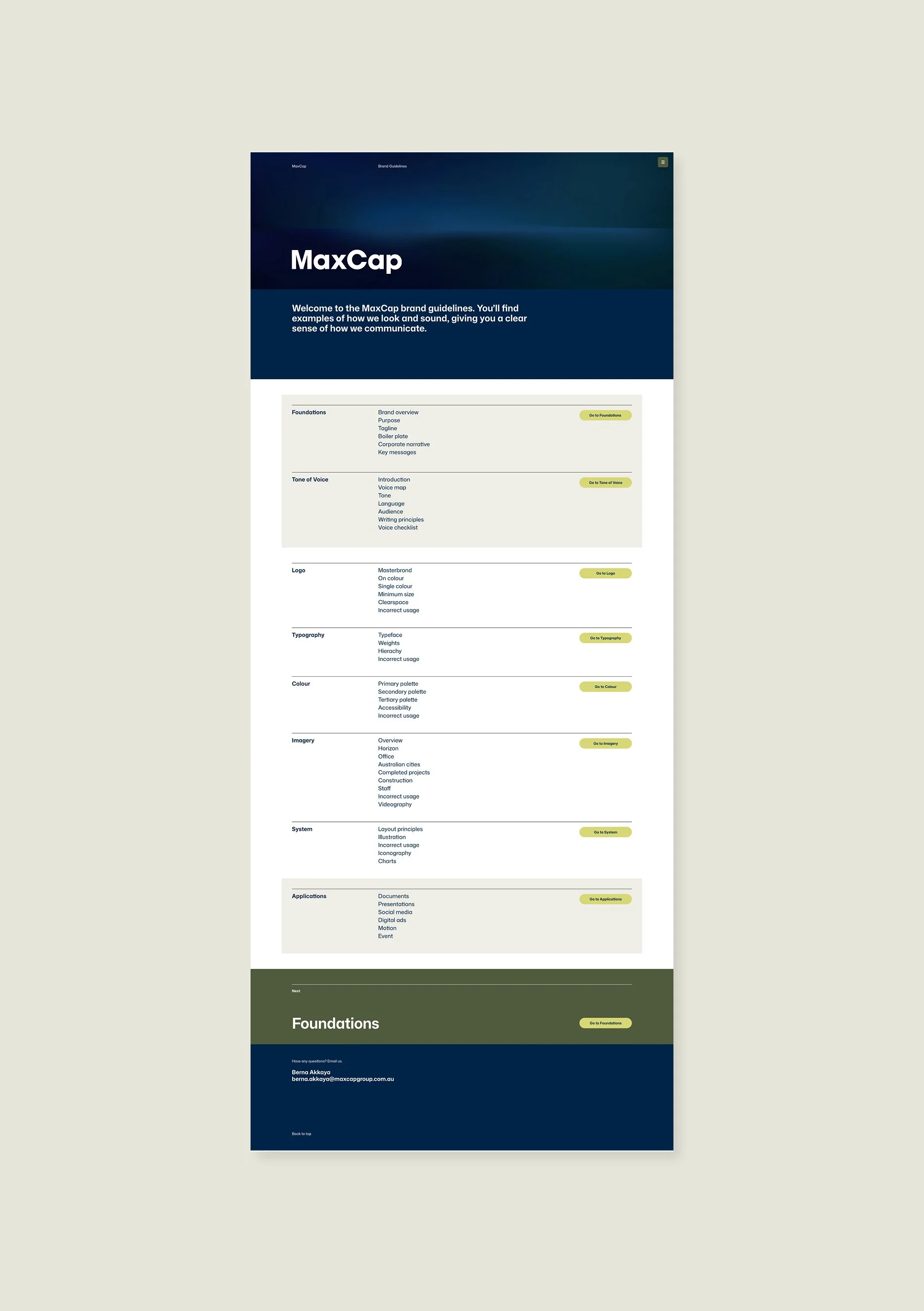
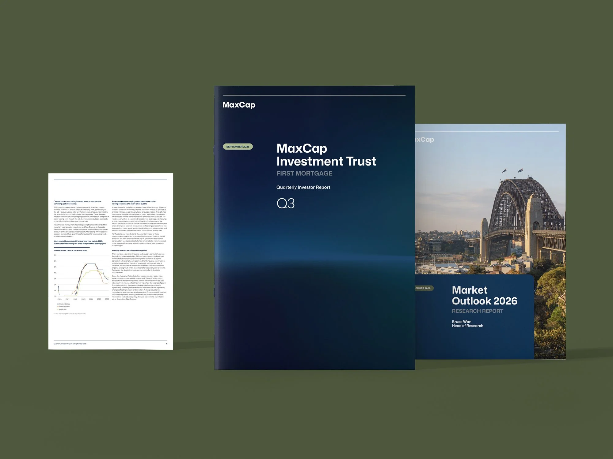
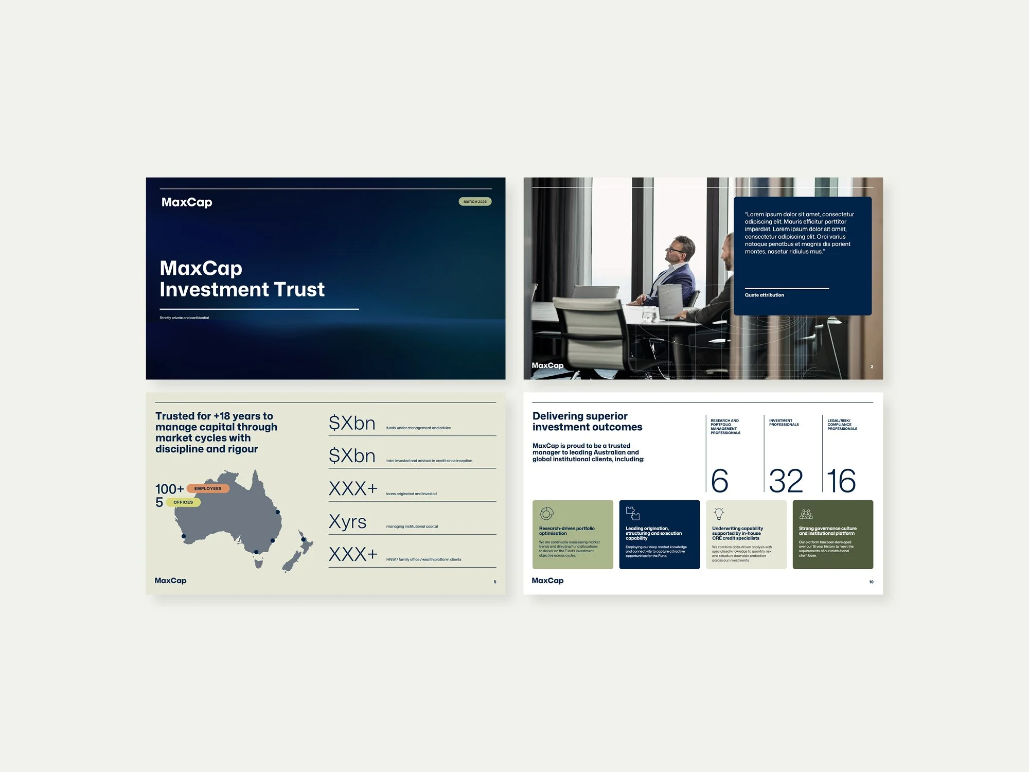
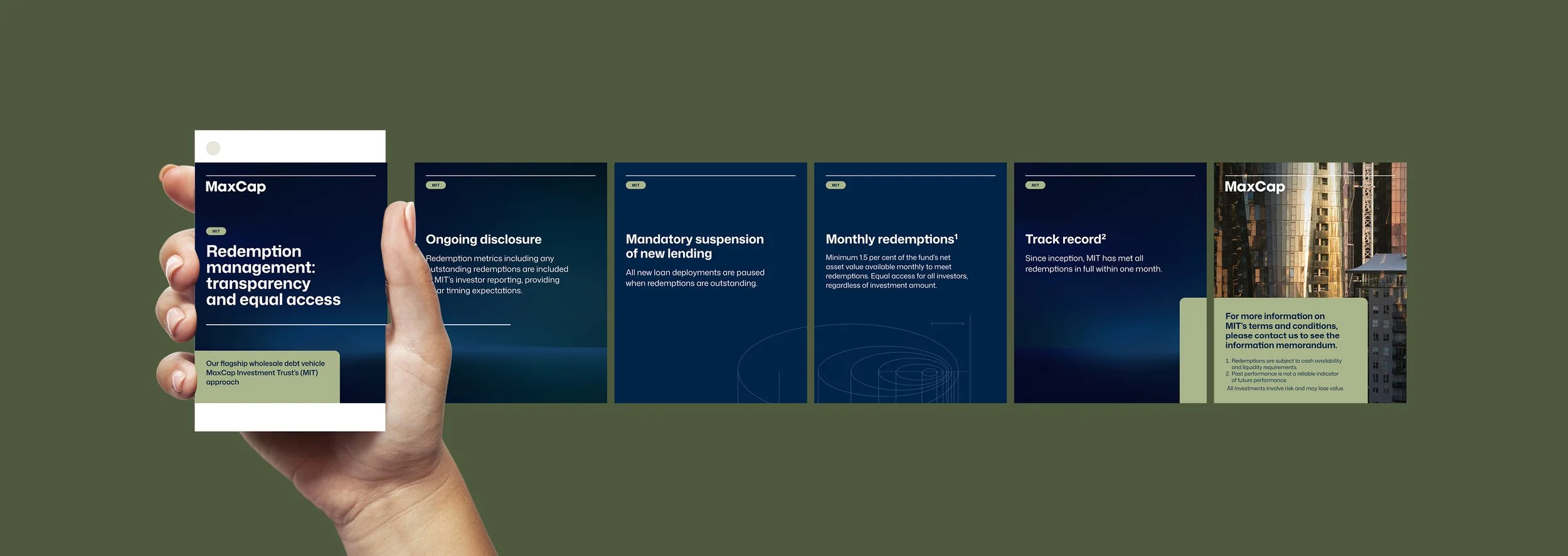
With the identity established, we rolled the system out across a wide range of collateral, including investor materials, templates and digital assets. The focus throughout was on practicality as much as aesthetics: creating flexible tools that allow internal teams to apply the brand consistently and to a high level of polish.
MaxCap now has a cohesive brand that reflects the business it has become and the market it is competing in. Across investor materials, its digital presence and day-to-day marketing, the system gives MaxCap a more distinctive and credible institutional presence, while providing the flexibility to support new products, audiences and future growth.
Brand Identity
Campaign
Collateral
Copywriting
Digital Assets
Event
Illustration
Motion
Photography
Website

“Studio Hoopla’s understanding of the finance and investment landscape was a huge advantage. They took the time to understand who we are, who we work with and the products we offer, which helped them create a brand that feels authentic and relevant. The project was extensive and Hoopla brought a great balance of strategic thinking, creativity and collaboration throughout.
The response from our team, investors, partners and broader stakeholders has been overwhelmingly positive, and we’re incredibly proud of the end result.”
Berna Akkaya, Marketing Manager at MaxCap